UC Berkeley Central Sierra Snow Lab
UI/UX Designer (Contract)
Figma
3 PMs
4 Designers
5 Developers
User Research
Web Design
Prototyping
September - December 2025
Role
Focus
Tools
Team
Timeline

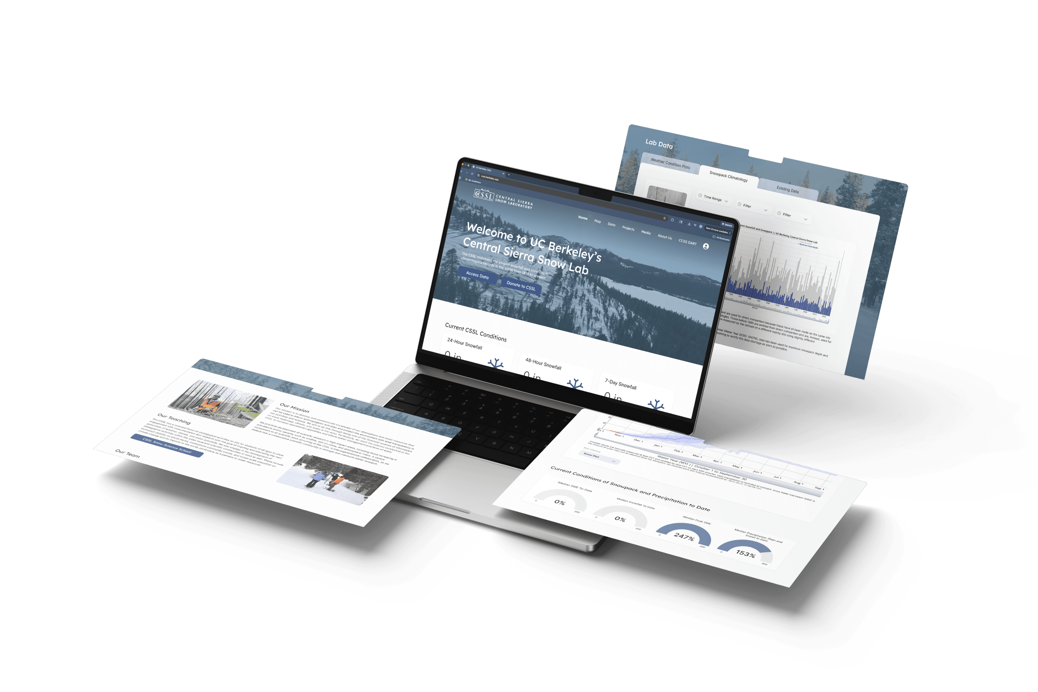
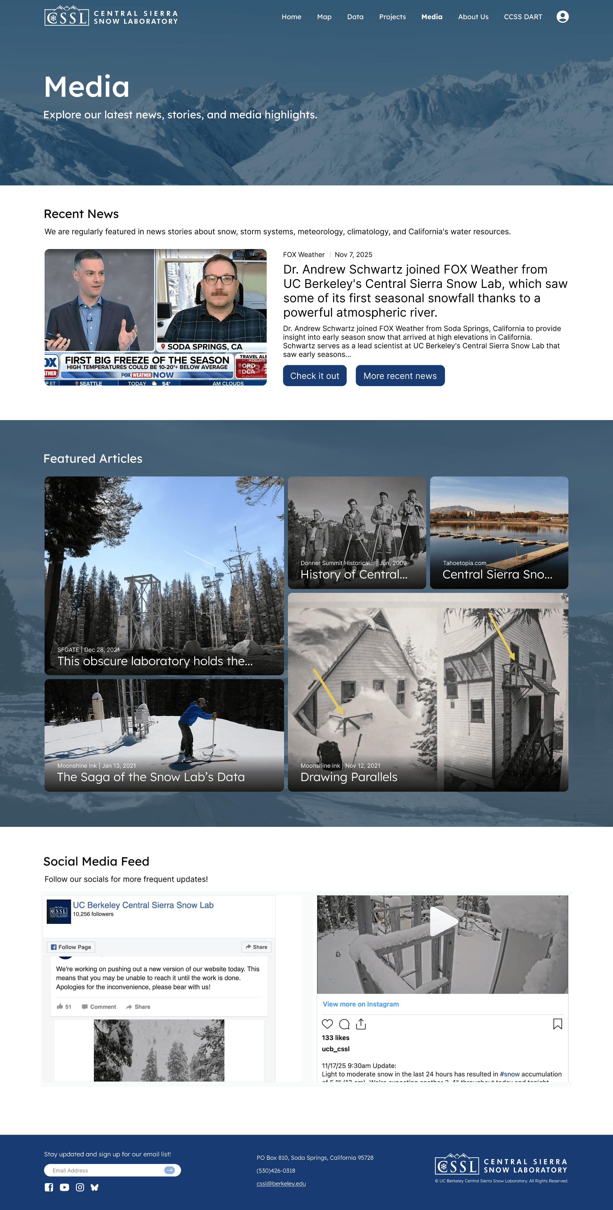
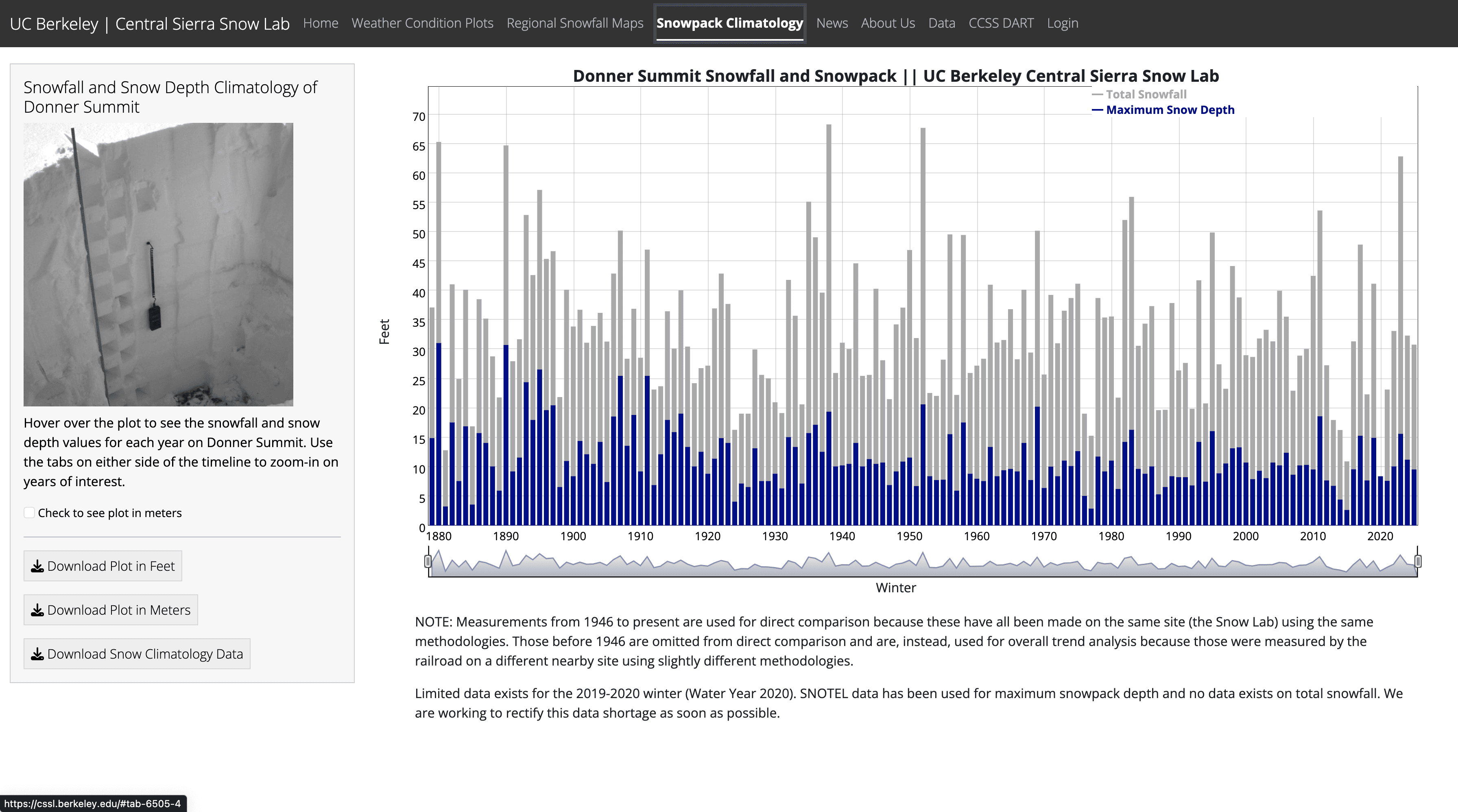
Data Page
Again, kept the same information but combined Weather Condition Data, Snowpack Climatology, and Existing Data into one page
Separate tabs for effective organization
Data Customization
Efficient Section Organization
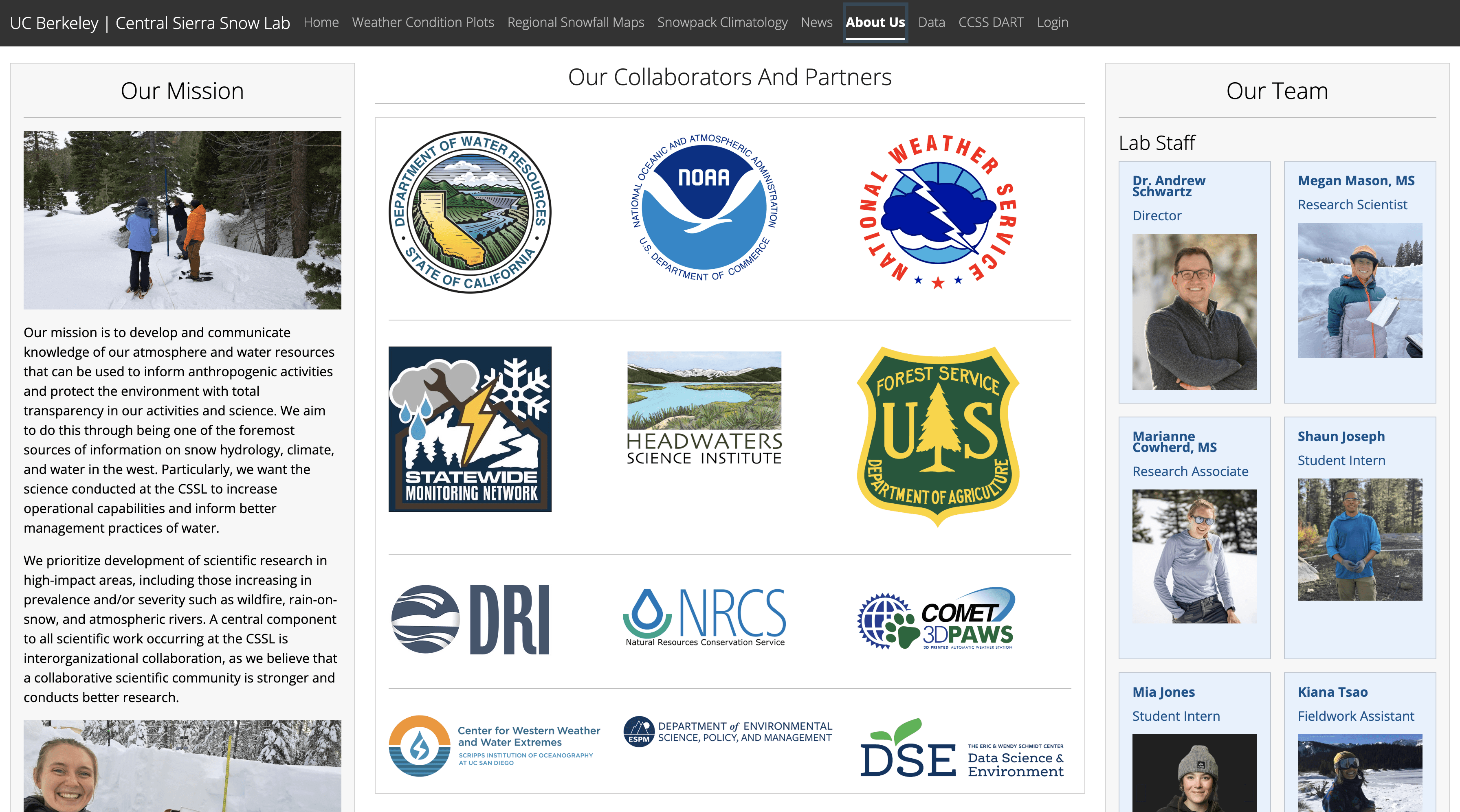
About Us Page
Implemented a hover feature to learn about CSSL’s staff stories
In addition to the information currently displayed, we added a scrollable timeline showcasing the Snow Lab’s history
Mission Advertisement
Staff Details
Scrollable History Timeline
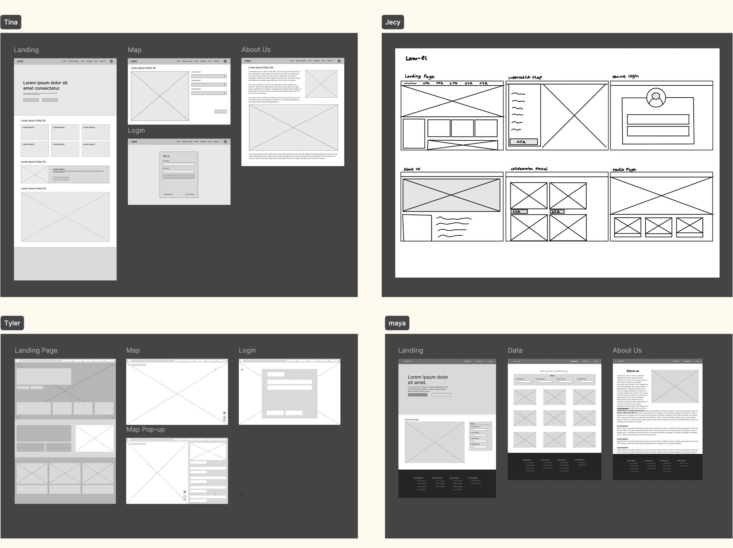
Prototyping
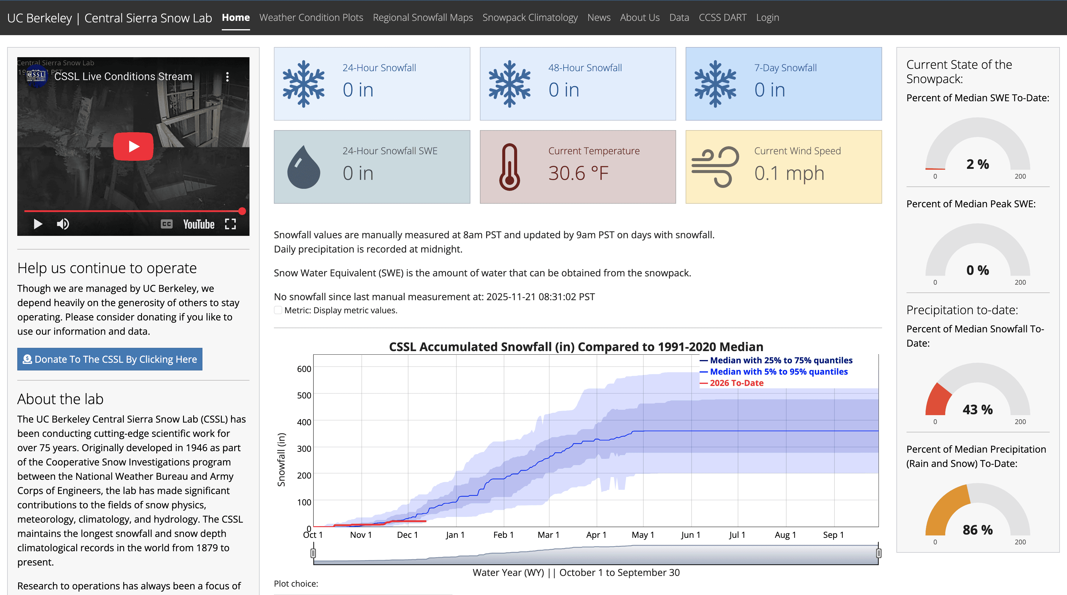
Landing Page
Kept the same information as original design--just made more organized and visually appealing
Researchers who are interested in datasets only can now access data directly from button on landing page
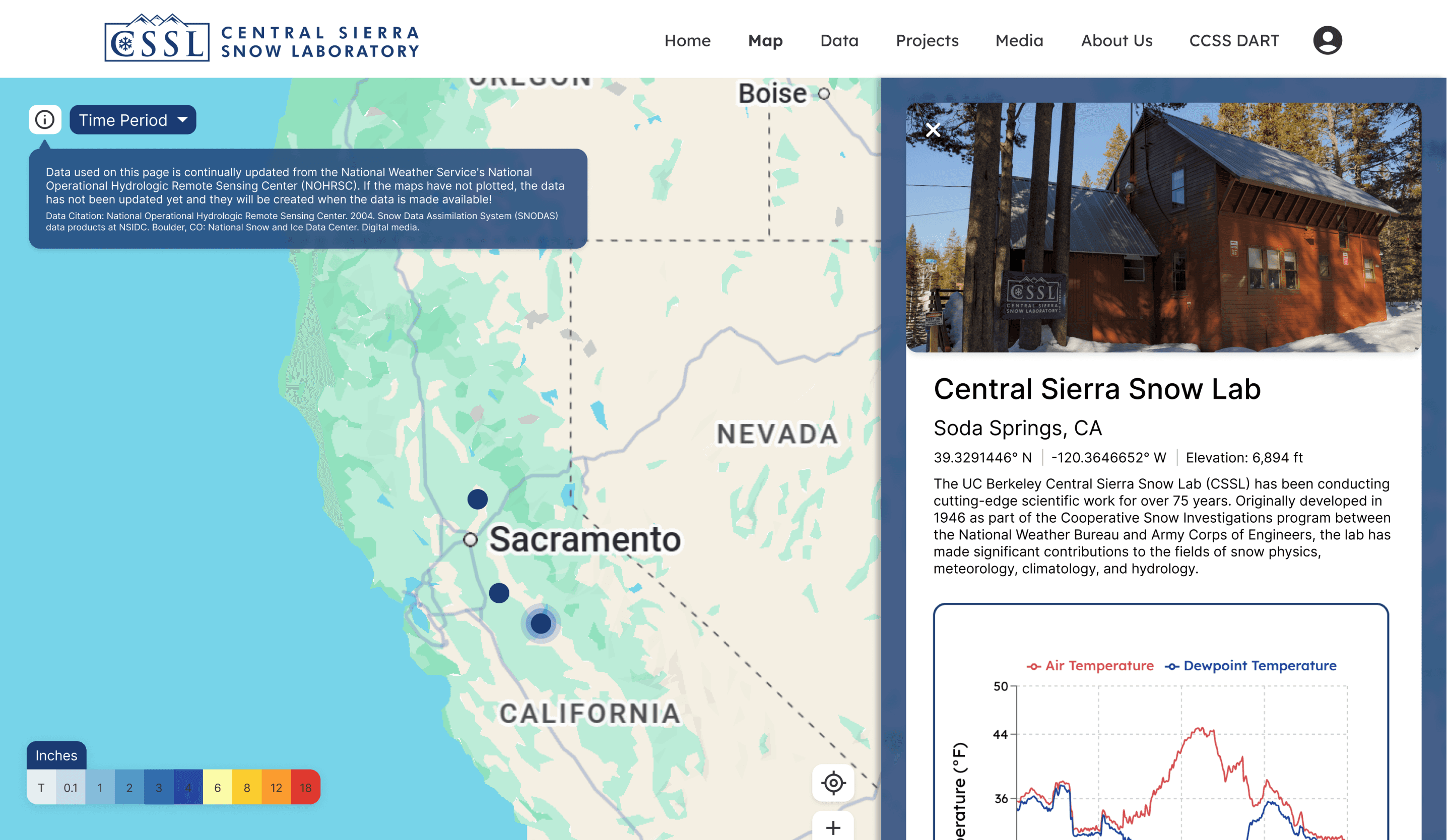
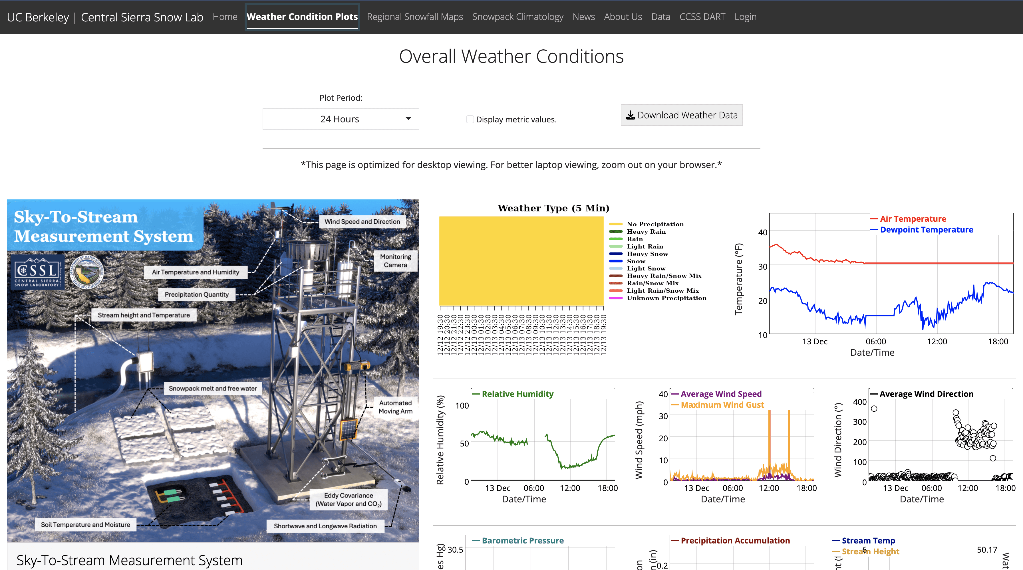
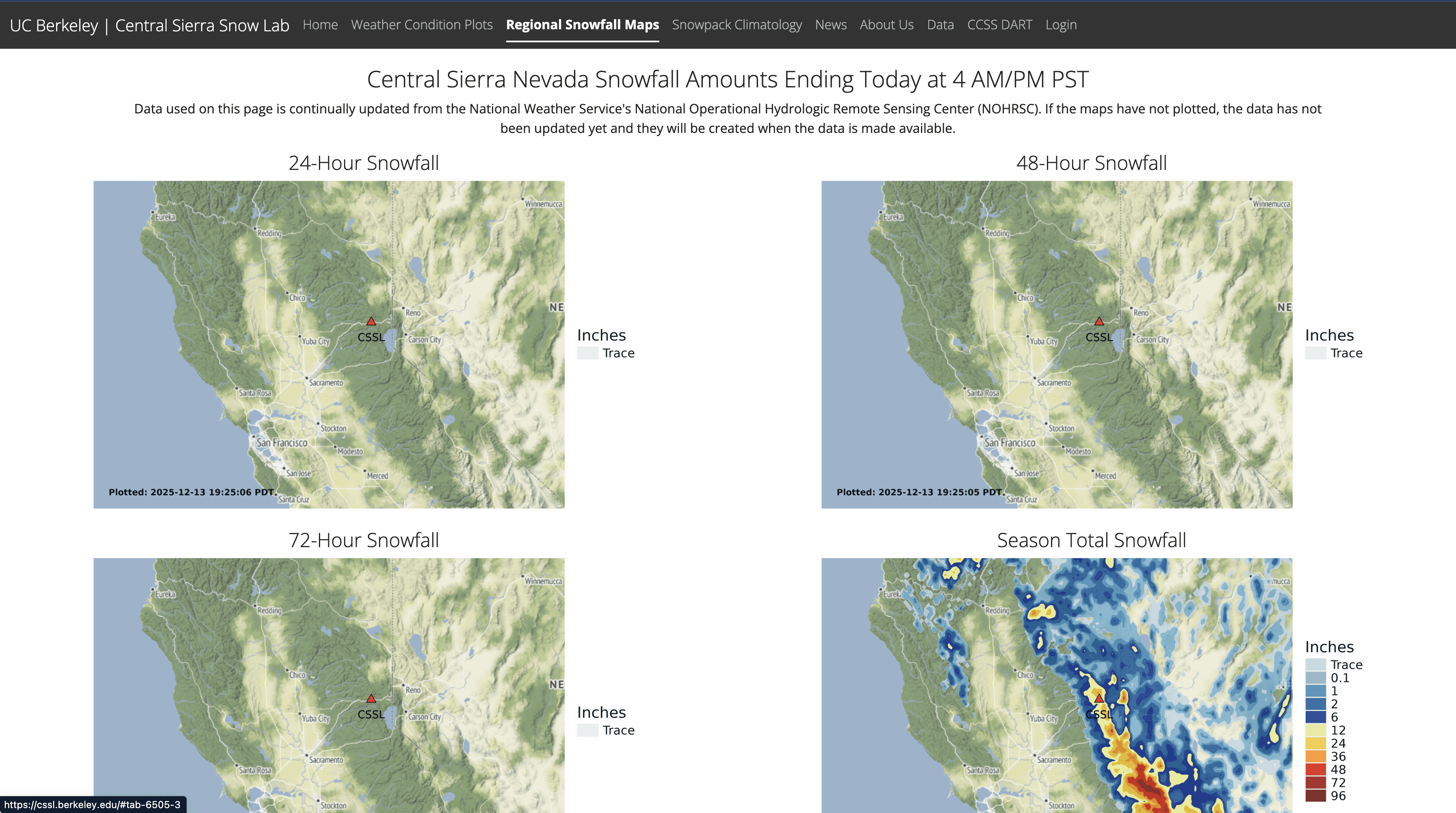
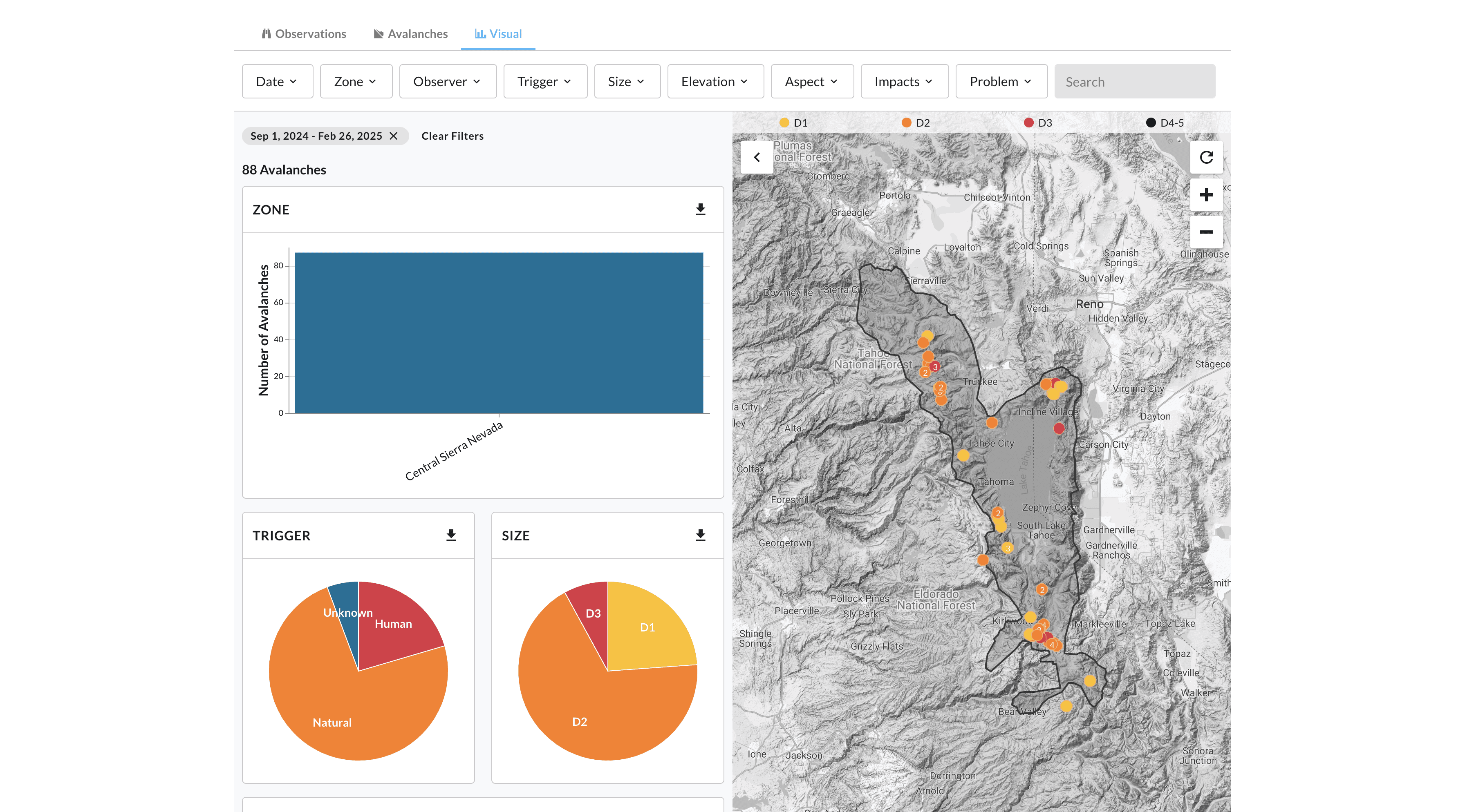
Map Page
The Snow Lab has several research stations and snow courses--the Map Page provides graphs and datasets of all facilities
Users can select snowfall reports from different time periods
Following rounds of low and mid-fidelity iterations, we produced final prototypes to support a seamless handoff to the developers on the team.
Visual Elements
Map Customization
Efficient Section Organization
Snowfall Graphs and Visuals
Data of All Facilities
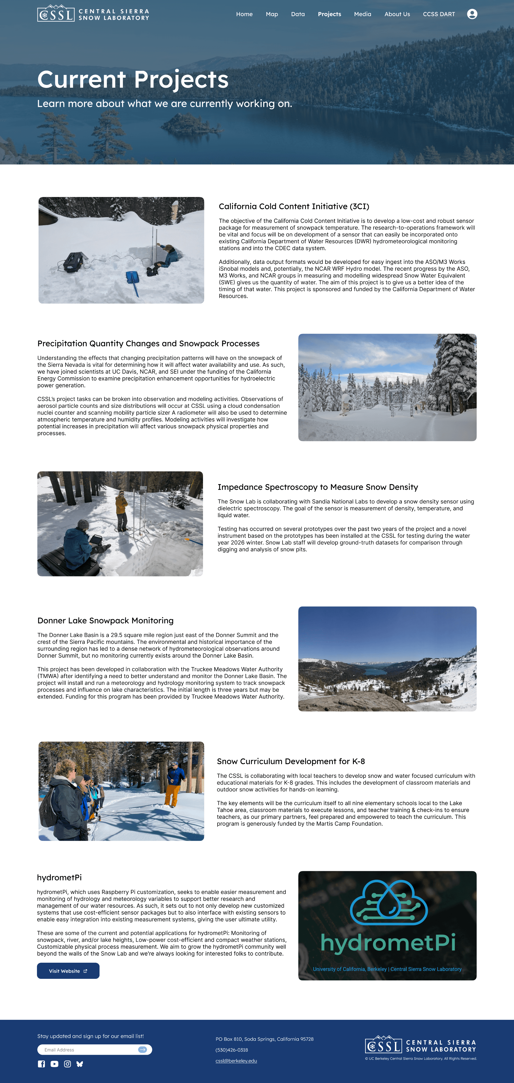
Additional Pages
Ideation
Following our synthesis process, our team create low-fidelity mockups to visualize new layouts and features for CSSL’s website.
Background
The UC Berkeley Central Sierra Snow Lab (CSSL) has been a leader in snow, climate, and hydrology research for over 75 years, maintaining the world’s longest continuous snowfall record. Our project focuses on redesigning their digital platform into a modern, data-driven website with interactive tools, real-time visualizations, and an improved admin workflow to better support researchers, collaborators, and the public.
Problem
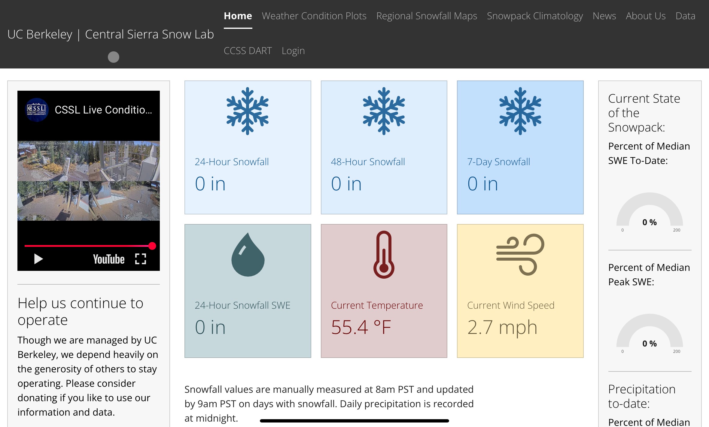
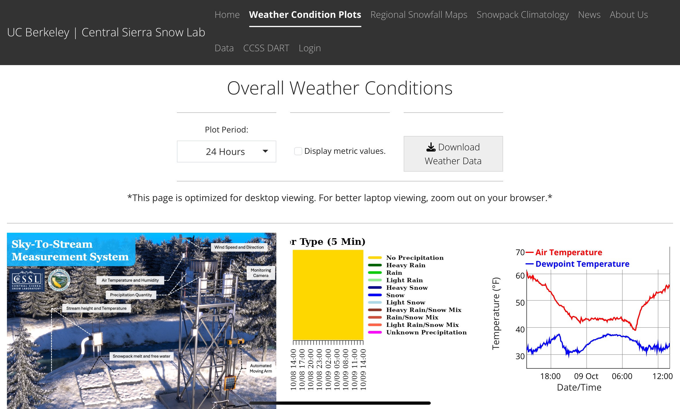
CSSL’s Current Website Interface
CSSL’s current website and data tools are outdated, difficult to navigate, and lack modern visualization capabilities. This makes it challenging for researchers, collaborators, and the public to easily access real-time snow and climate data. The lab needs a clearer, more intuitive digital interface that streamlines data management, improves usability, and accurately reflects the impact of their scientific work.
HMW Statement
How might we redesign CSSL’s digital platform to make real-time snow and climate data easier to access, understand, and manage?
Context
Research
Competitive Analysis
First, we conducted competitive analysis of multiple organizations to identify effective patterns and pitfalls, drawing insights to brainstorm CSSL’s pages and features.
Due to the project scope and timeline, our research was intentionally limited to prioritize delivering a hi-fidelity prototype for developer implementation. Despite this, we are confident that the methods we chose provided the necessary insights to effectively redesign CSSL’s website.
User Interviews
We asked 10 users (a mix of students, researchers and journalists) of the Snow Lab website about their experiences using the websites and what they thought could be improved. The main feedback we received was:
The data graphics imagery were outdated
There were too many tabs on some pages, leading to confusion
There was an inconsistent layout across different pages, leading users to be disoriented
There was a lack of graphics & imagery
They would prefer more interactivity elements on some pages, because it is currently not engaging
Important Quotes from Users:
“Its just a lot all at once and its hard to see what to focus on”
“There are way too many words”
“It’s hard to find what I want because it’s very disorganized”
Snow Lab
Organization
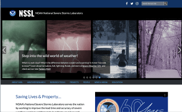
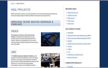
NOAA National Severe Storms Laboratory
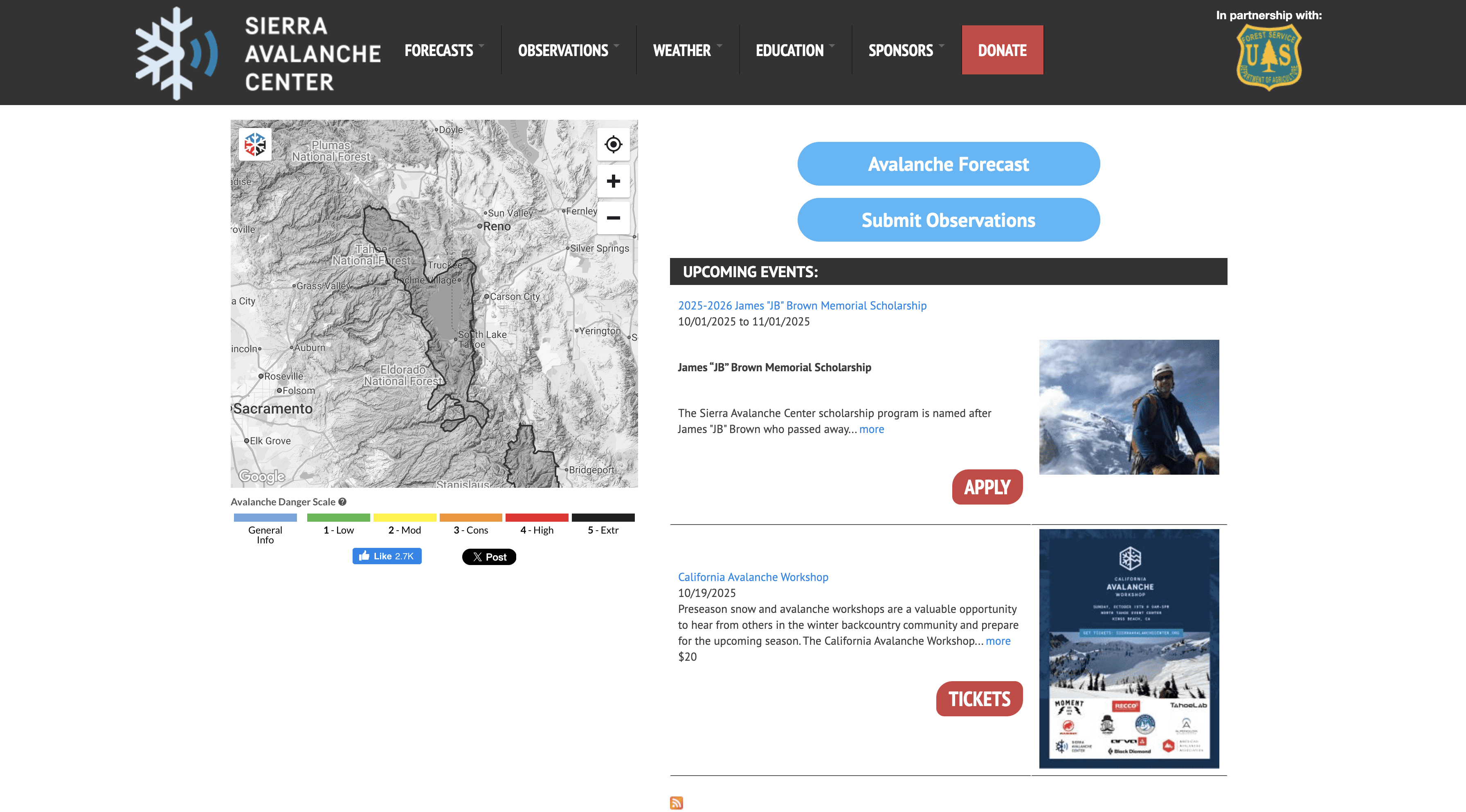
Sierra Avalanche Center
National Home and Ice Data Center
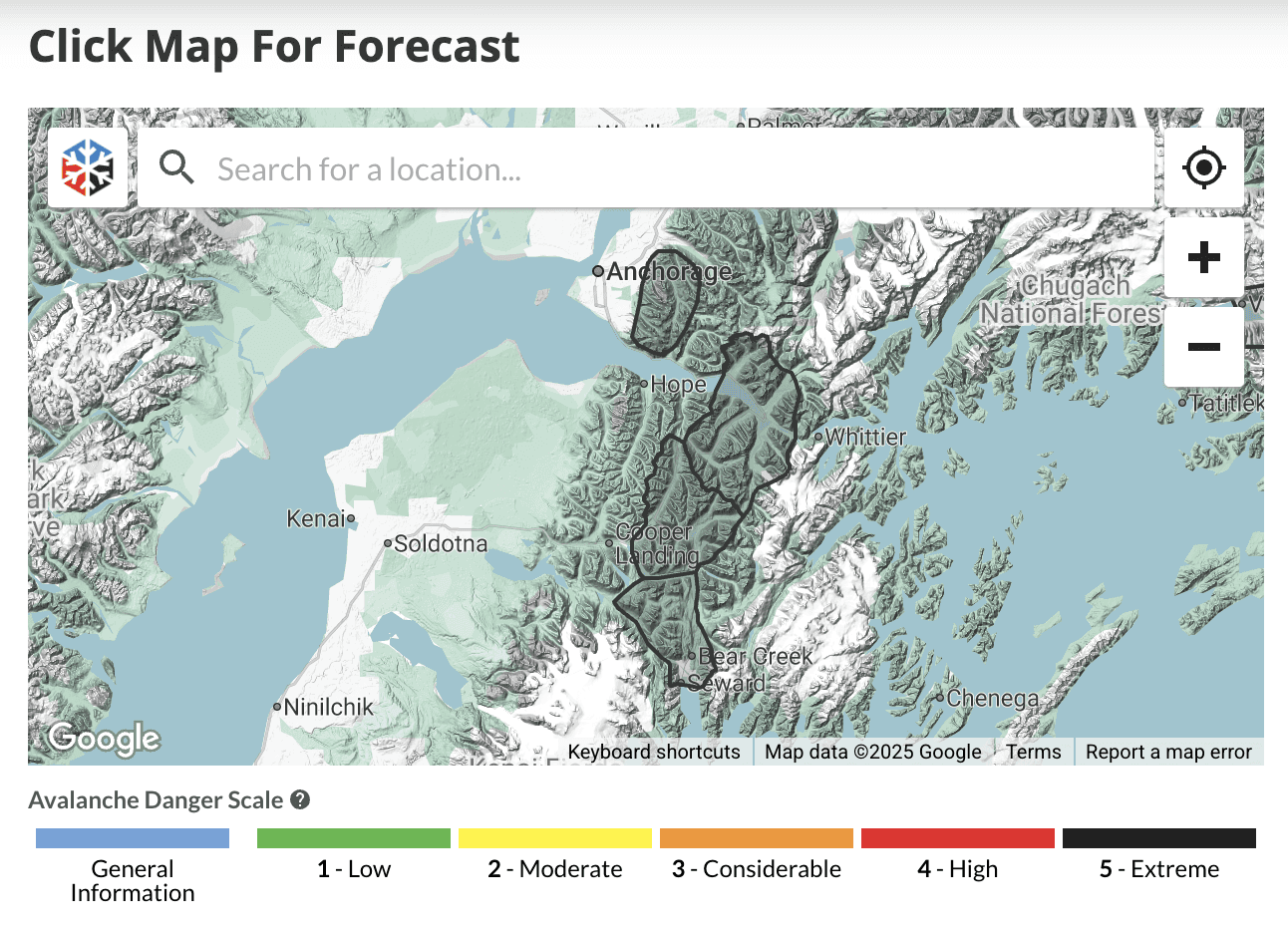
Chugach avalance center
Info
Located in Sierra Nevada, UCB associated, studies snow hydrology, climate, etc
Improve time/accuracy of severe weather warnings/forecasts
Provides avalanche forecasts, observations, and educational resources
Enables users to better understand the cryosphere, why it’s important and how it’s changing.
Records weather, makes observations, predicts avalanches
Key Features
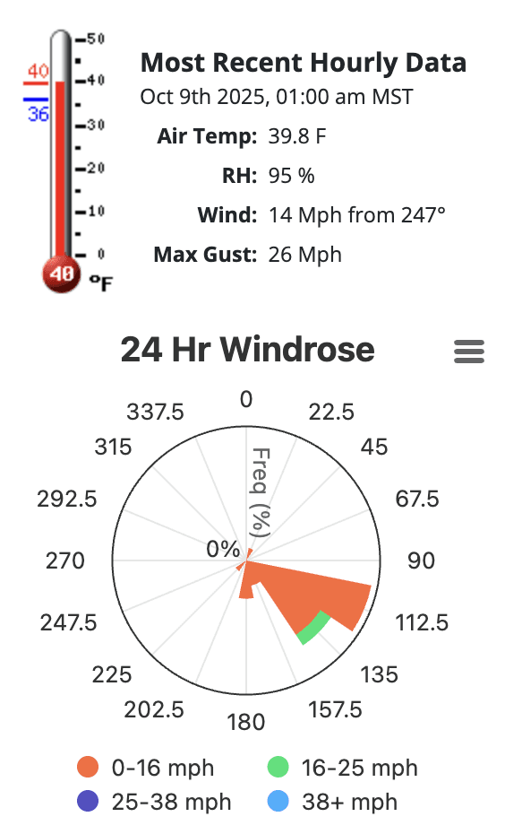
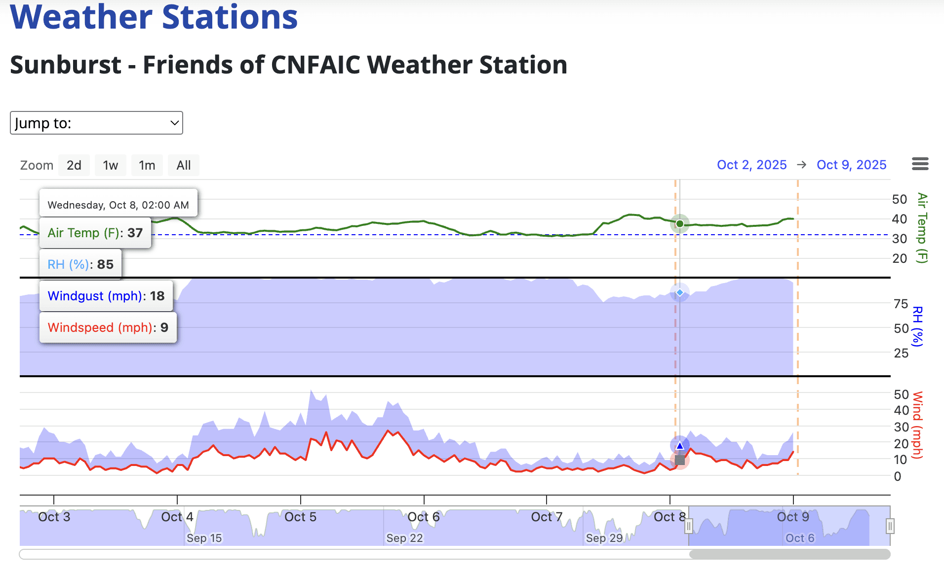
Weather conditions plots, snowfall maps, climatology data, downloadable data, news page
In-depth weather research, list of research tools, highlighted projects
Color-coded map indicating danger scale, observation graphs, educational guides
Educate people on frozen regions, present news and related data, carry out programs
Has forecasts, observations, weather, accident info, a map, general avalanche info
Screenshots
Users
Staff members, students, researches & scientists in the field, news reporters
Staff, students, meteorologists, hydrologists, physicists, engineers, computer scientists
Skiers/snowboarders, rescue teams, researchers/scientists, news reporters
Staff members, students, researches & scientists in the field, news reporters
Ski patrol, skiers/snowboarders, people from bay deciding whether to drive up, snow sport enthusiasts
Strengths
Lots of data, some interactivity, decent design system
Simple navigation bar, concise organization of information, visuals, consistent design system
Clear navigation bar, lots of data and visuals
Good at representing data, visually organized, easy to understand but still contains too much complex info
Presents lots of data in a straightforward way, easy to navigate/find what you are looking for
Weaknesses
Confusing organization, bad layouts, cluttered navbar, data graphics imagery outdated, not scalable
Text heavy on some pages, lots of tabs on each page → confusion
Lack of graphics & images, text heavy, cluttered UI, inconsistent layout across different pages
Some parts of the website are outdated, there are no observations and only one avalanche recorded, even in previous years
Lots of messy info presented sometimes, news section messy and requires user to know what are looking for
Opportunities
Interactive & animated buttons & graphs, clearer organization, better UI
Include infographics/charts for reports, more interactivity elements on pages
Landing page with image, consistent design system and layouts
More digestible news section, lighter colors, focus on education/opportunities
Updating the website using creative ways to show data
Synthesizing From Research
User Persona #1
User Actions
User Steps
Goals & Experiences
Feelings & Thoughts
Pain Points
Opportunities
Awareness
Finds out about CSSL through academic references and other researchers
Hopes to discover credible, long sources data for snowfall research
Intrigued by academic references, curious to discover more
Hadn’t heard of CSSL prior, not sure if its reliable
Marketing themselves as a reliable source of data
Consideration
Visits the CSSL website to check what features and data it offers
Evaluates the quality of data/graphs and the website’s accessibility
Intrigued by all the data and graphs but feels the need to verify validity
Confusing navigation on the website, sees graph generation is also slow. Takes a long time to find the graphs deeded due to broken links
Navigation bar redesign, quicker data generation tool
Service
Uses CSSL data to for research analysis and comparisons. Contacts CSSL for validity of data
Wants to incorporate data from CSSL within her own research
Appreciative of how data sets can provide her with research findings
Occasional delays while trying to access more data. Inconsistent data labeling or missing metadata
Fixing missing data and mislabeled data
Loyalty
Trusts CSSL with research findings. Comes back to CSSL for further research
Hopes to continue using CSSL for her research
Feels secure in the validity of data. Appreciative of CSSl’s role in her research
New generation tool
Still having difficulties downloading data efficiently
Acquisition
Downloads data for specific years, looks at data visualization for research
Wants to efficiently access and organize data
Frustrated by slow download and unclear navigation
Simplify downloads. layout redesign for better nevigation
Technical struggles while downloading the data, takes too much time
User Persona #2
User Actions
User Steps
Goals & Experiences
Feelings & Thoughts
Pain Points
Opportunities
Awareness
Discovers CSSL through a friend who is also passionate about snow sports
Wants to understand what specifically CSSL does and how it can be beneficial
Curious about how data from CSSL can help with trip planning
Hard to understand what CSSL does as it is not commonly known among non-researchers
Clearer display of an “About CSSL” section
Consideration
Visits CSSL website and clicks through its features
Wants to see whether the site is student-friendly and if it can be used for weather insights
Slightly confused and overwhelmed by the large amount of graphs
Dense datasets across multiple pages, cluttered graphs
Beginner friendly summaries, clearer labels
Service
Revisits the site to plan for an upcoming ski trip. Looks at live footage video of the lab
Wants to get quick updates with minimal reading and graph interpretation
Relieved that there is a live footage video to help visualize current conditions
Wants to access more advanced data but website feels difficult to navigate through
Clearer organization and explanations on the website
Loyalty
Checks CSSL prior to every snow trip
Stay consistently informed about changing weather and snowpack
Trusts CSSL as it provides accurate data
UI redesign landing, data, and about us page
Still wishes for better organization
Acquisition
Attempts to check real time conditions
Wants to interpret data to determine whether conditions are safe for a skiing trip
Frustrated as there are way too many charts; cannot tell which ones are relevant
to goals
Explanations for each graph, context for sections
Lack of explanations for graphs, hard to interpret data
To better understand CSSL users who are researchers in the field, we developed a user persona based on our interview insights. By developing a persona, we ensure our solutions address real user motivations and pain points.
Meet Dr. Emily Chen:
Meet Lucy Smith:
Dr. Emily Chen
Age: 34
Occupation: Climate Researcher, Science Journalist
Location: San Francisco, CA
Education: Ph.D. in Environmental Science
Tech Proficiency: Advanced (Regularly uses data visualization and analysis tools)
Emily frequently covers environmental issues such as climate change, drought patterns, and snowpack variability in California. She often relies on university and government data sources to back her articles and research projects. Her deadlines are tight. She values direct access to reliable and well-documented datasets.
Bio
Find and download accurate, historical snowpack and snowfall data for research and publication.
Compare trends over time (e.g. 50-year changes in snowfall at the Sierra Nevada).
Cite data sources accurately for articles and academic references.
Visualize key findings (such as snowfall anomalies or record-breaking seasons).
Goals
Difficulty locating the right dataset in multiple tabs or formats.
Inconsistent data labeling or missing metadata.
Slow downloads or broken links for large datasets.
Limited context or methodology documentation for the data.
Needs publicly accessible data.
Pain Points
Motivations
Lucy Smith

Age: 19
Occupation: Student
Location: Berkeley, CA
Education: Economics @ UCB
Tech Proficiency: Average
Lucy is a curious university student who is deeply motivated by environmental issues and scientific storytelling. She often plans quick mountain trips for skiing or hiking, making accurate and accessible weather updates essential. She seeks intuitive, visually-driven data to quickly understand its relevance to her everyday life and academic interests.
Bio
Become more involved in climate and snow research, especially through CSSL
Stay updated on weather and snow conditions in real time
Translate complex datasets into meaningful visual insights that are clear in organization
Efficiently trustworthy climate and weather data quickly
Goals
Difficulty locating the correct dataset when information is spread across multiple tabs
Wants access to more complex data but has limited experience interpreting scientific charts and terminology
Is overwhelmed by scientific terminology; wants easily digestible information
Pain Points
Motivations
We also created a user journey for Dr. Chen to further pinpoint exactly where we need to implement new design solutions to address user needs.
Next, we came up a second persona and user journey to address the needs of those who are not professionals in the field.
Affinity Mapping
We listed out the strengths, weaknesses, and opportunities of every competitor we researched and organized the findings.
Green = Strengths, Red = Weaknesses, Blue = Opportunities
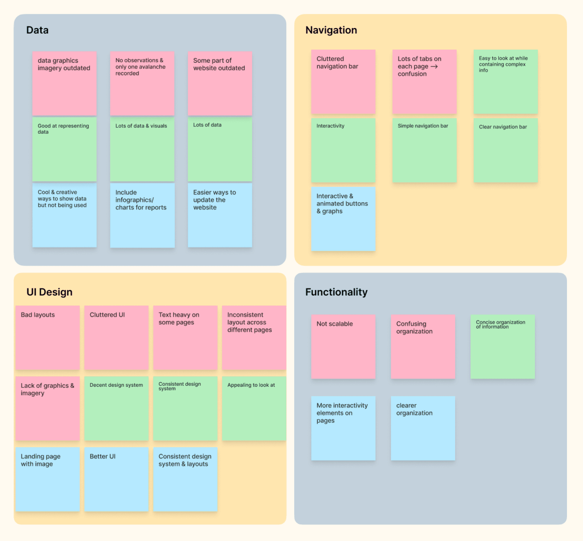
From affinity mapping, we can apply the following insights to redesign Snow Lab’s website:
Data
Lots of color coded graphs and maps
Large data sets with better organization
Navigation
Minimal nav bar with more efficient organization
UI Design
Reorganize layouts
More imagery & graphics
Keep consistent design system
Appealing visuals
Functionality
Make sure it’s scalable --> accessible for mobile and tablet
More accessibility, interactiveness
Reflection

I had an amazing time working on this project alongside my team members. I especially loved how much creative freedom this project gave us as it was a complete website redesign, which allowed us to explore ideas through many iterations. While working on the history timeline in particular, I learned how important it is to communicate closely with developers throughout the design process. It is essential for designers to consider what features can realistically be implemented within technical and time constraints.
I am so grateful for this lovely team as we had such a collaborative and rewarding experience! I also want to thank the CSSL team for trusting us with this website redesign.