Lafayette Square Institute

Background
Lafayette Square Institute aims to bridge the gap between policymakers and investors. The organization provides US policymakers across the political spectrum with the insights, data, and resources needed to mobilize private investment to generate prosperity for more people.
The Ask
Develop an internal full-stack report generation tool to dynamically create the 535 Insights Report, featuring key data metrics on Housing, Employee Ownership, and Job Quality across multiple levels of geographic granularity.
- Dynamically populate fields with Snowflake data
- Allow for simple version tracking using existing user authentication
- Update report layouts for easy rich text editing
- Flexibility to integrate new themes and branding
Due to a development-heavy project scope and client request, our design team immediately started ideating low-fidelity wireframes to ensure our final prototype would be delivered on time for developer implementation.
Low-Fidelity Iteration #1
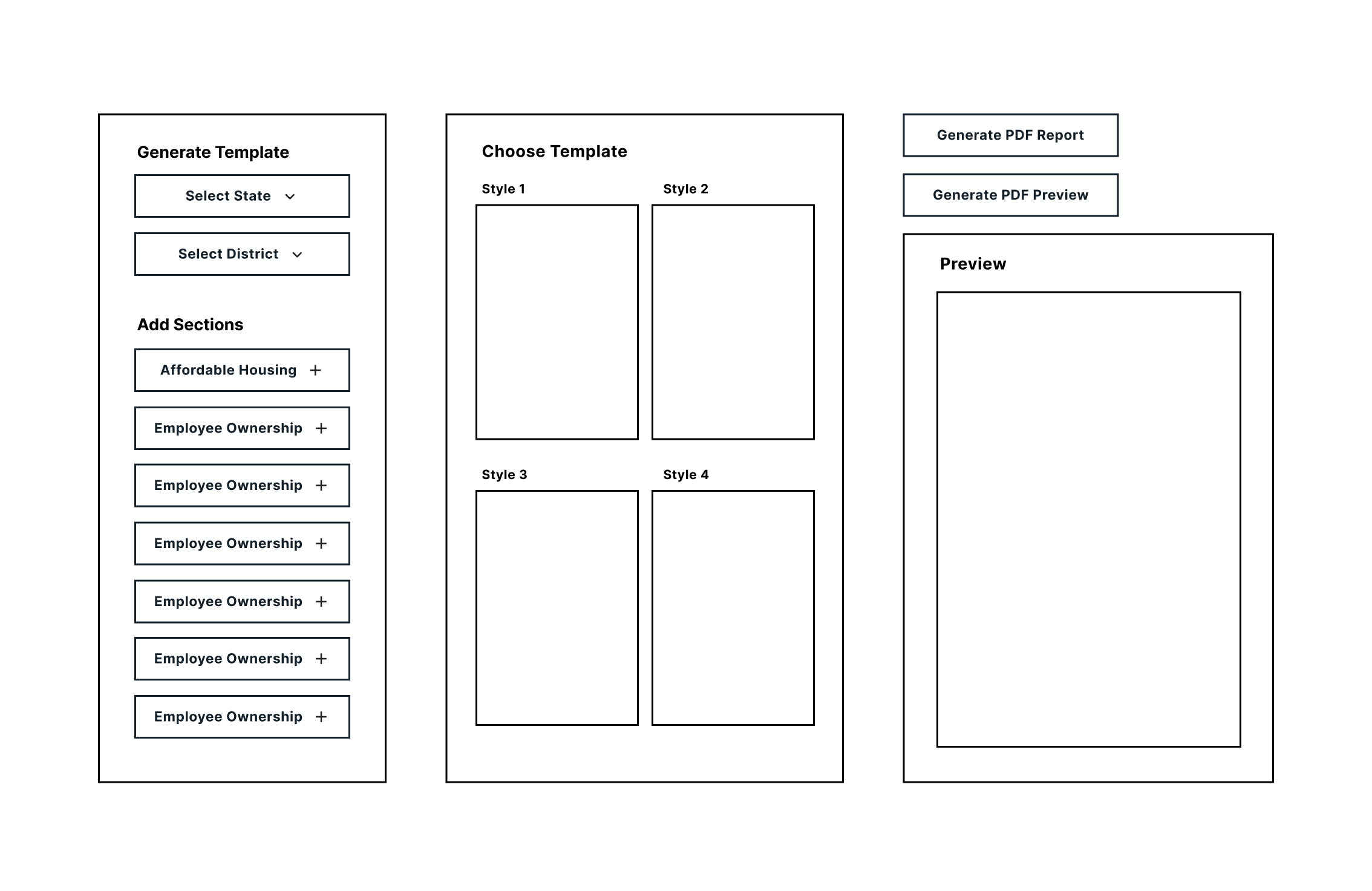
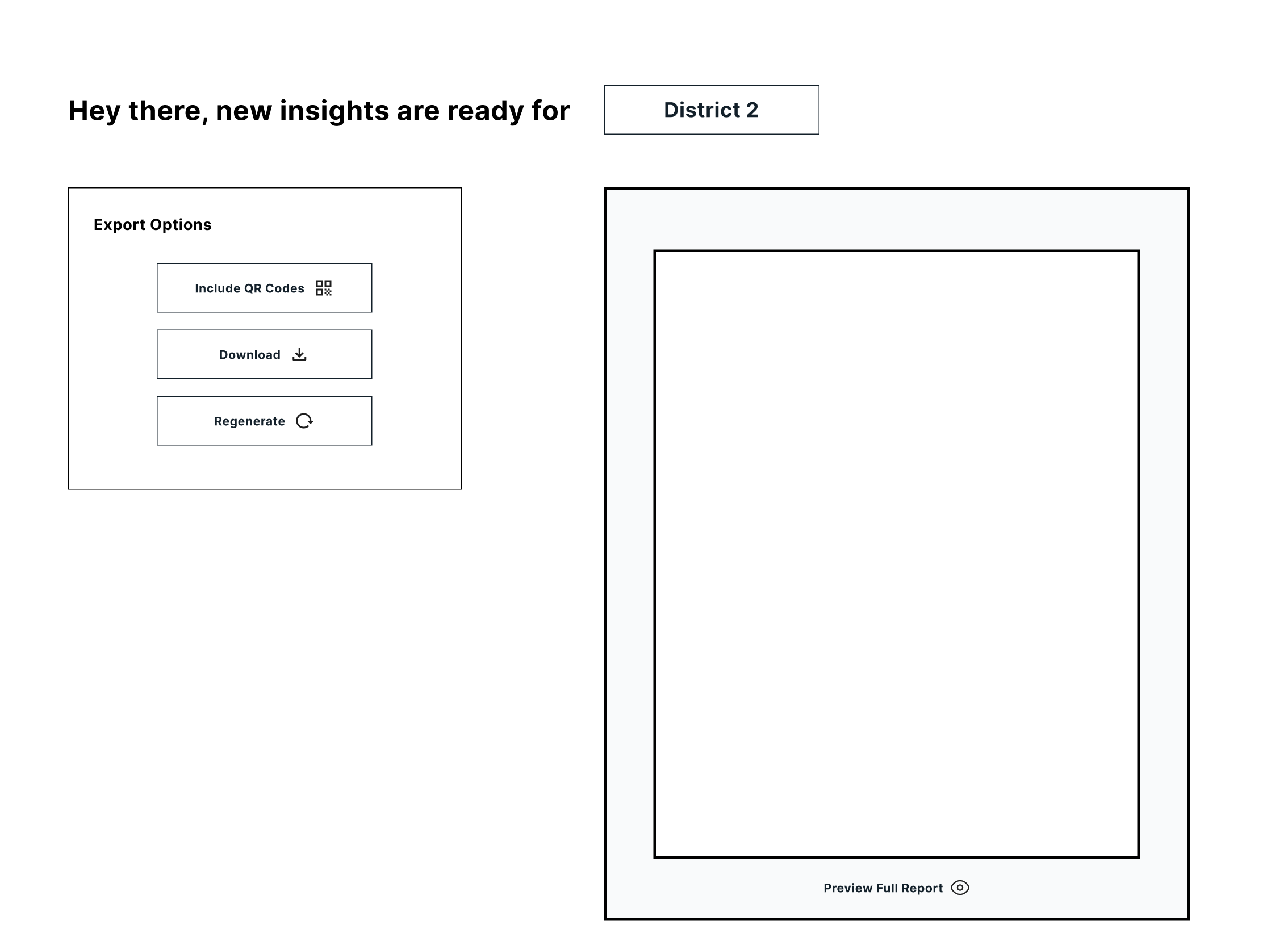
Initially, we planned to place all customization features on a single page, with the goal of creating a straightforward and efficient experience. After the user selects all the customization features and generates the report, they will then be taken to the second page to view the report on full screen.
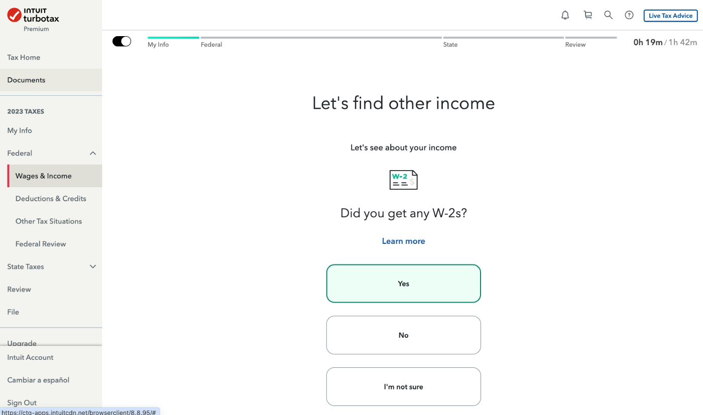
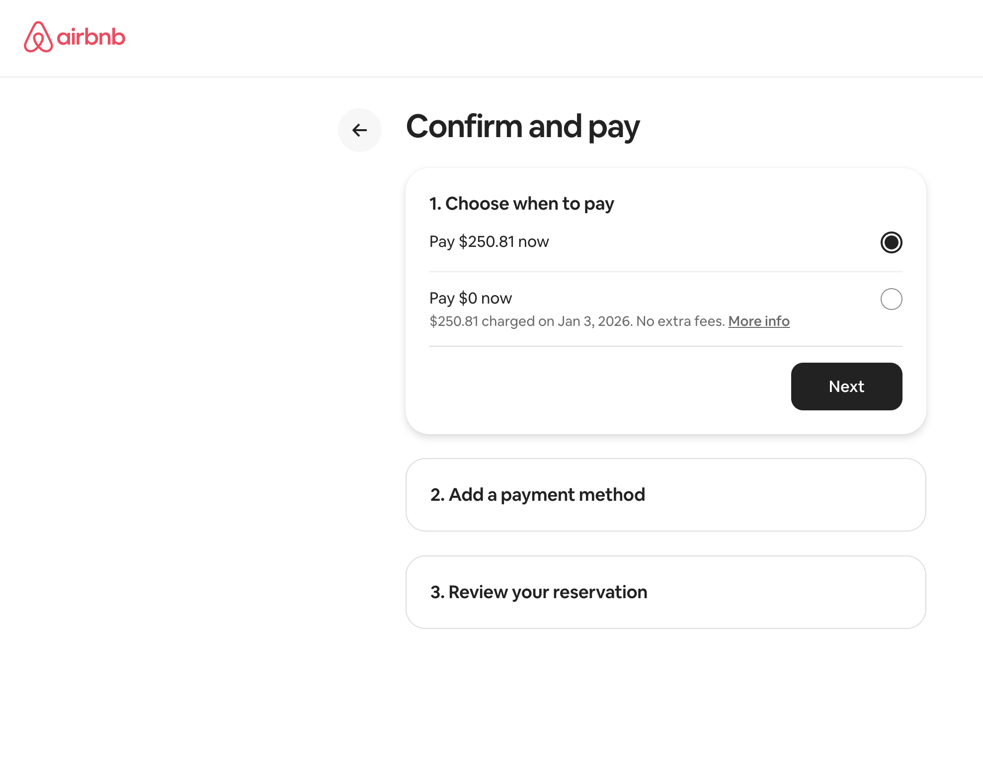
Many platforms use a multi-page approach to guide users through each step of a process. To explore this pattern, our team examined TurboTax and Airbnb, which effectively break down user flows into sequential steps.
Intuit TurboTax:
Airbnb:
Takeaways
1. Clear Progress Indicators
Users know where they are in the process and what steps remain, which reduces uncertainty.
2. One Primary Action Per Step
Each screen focuses on a single decision, which minimizes users’ cognitive load.
3. Guided Decision-Making
Users know exactly which steps to follow to ensure the end goal is reached.
User Journey Map
Following our research, we began dividing the customization steps into four phases and making a user journey map.

Low-Fidelity Iteration #2
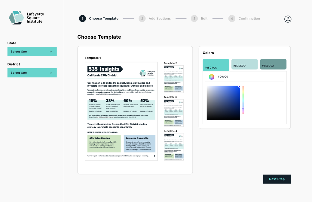
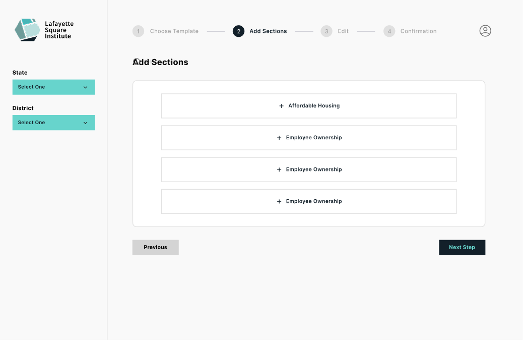
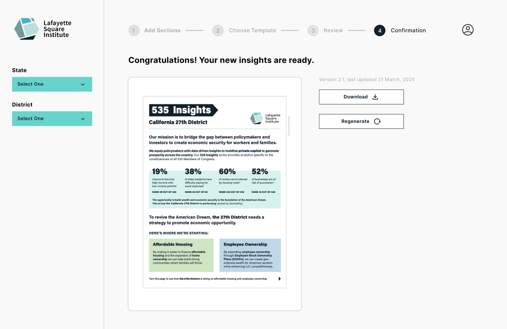
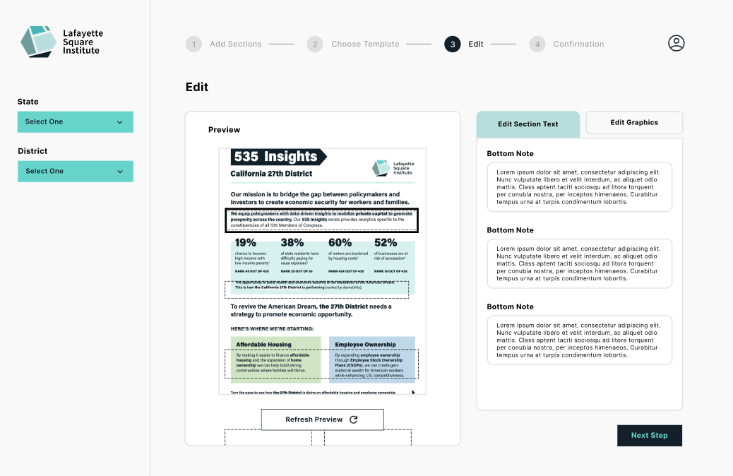
With the journey map and phases in mind, we made a second iteration of our low-fidelity wireframes. In this new iteration, we made a progress bar and divided the sections into multiple pages.
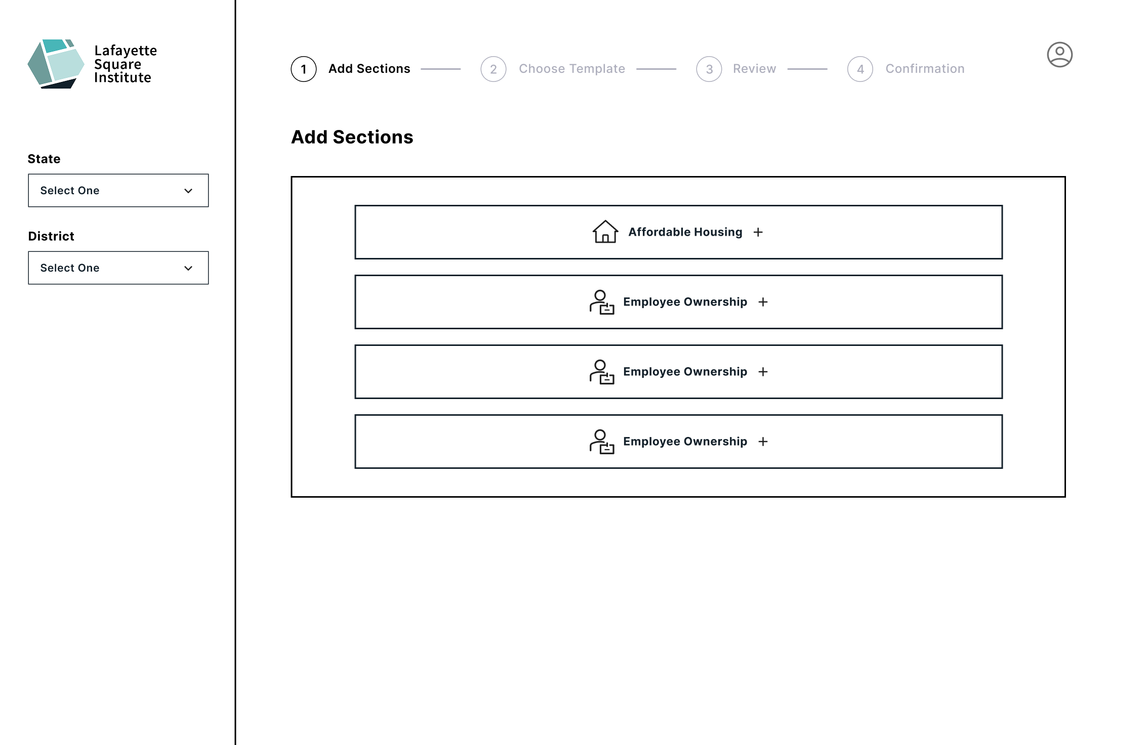
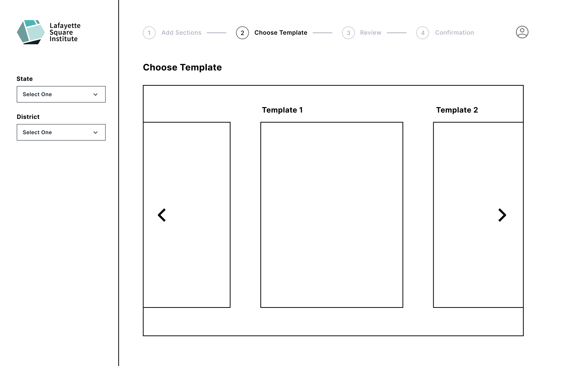
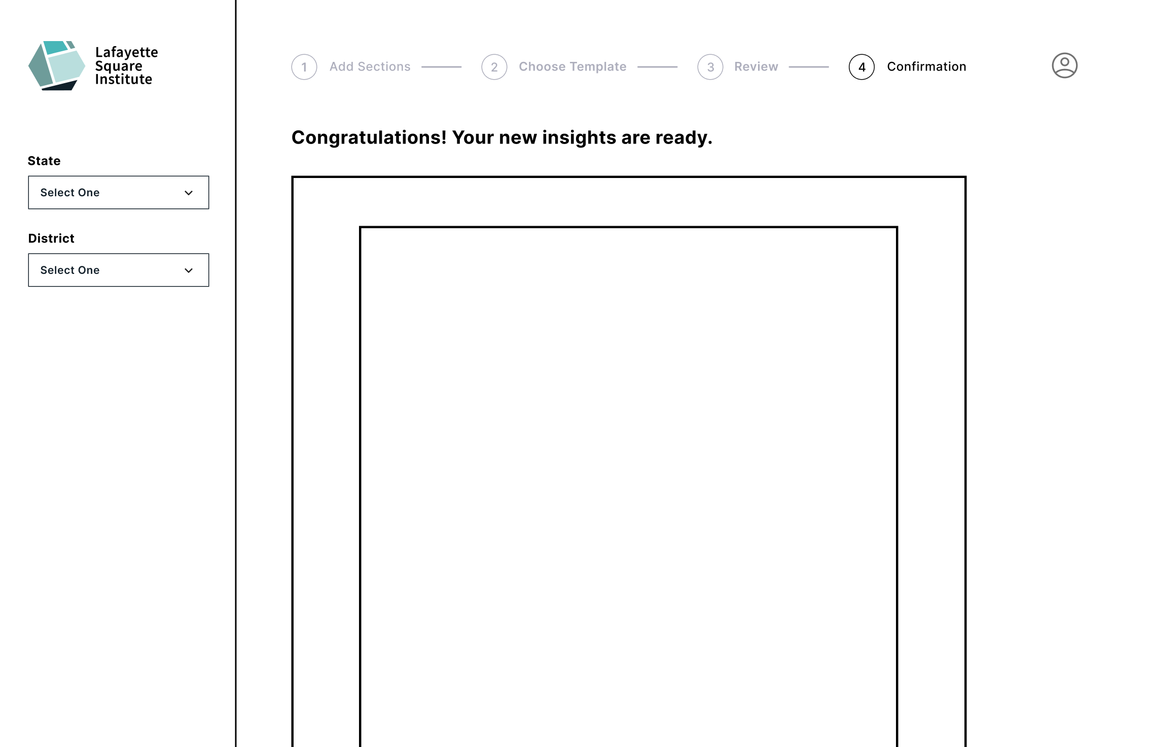
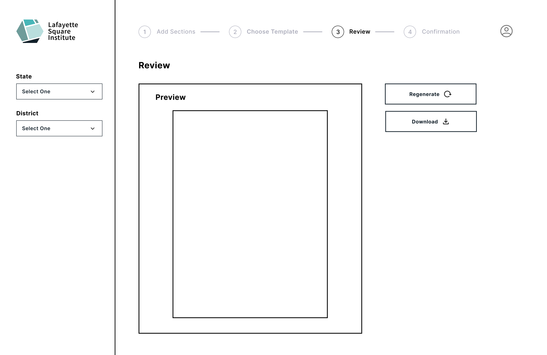
Finally, using Lafayette Square Institute’s design system, we finalized a high-fidelity mockup ready for developer implementation.
This project was essential to my growth as a product designer, as it taught me that design is rarely a linear process. When implementing complex features, I learned that progress often requires moving back and forth between research, ideation, and iteration in order to arrive at thoughtful solutions. I’m really thankful for this experience!