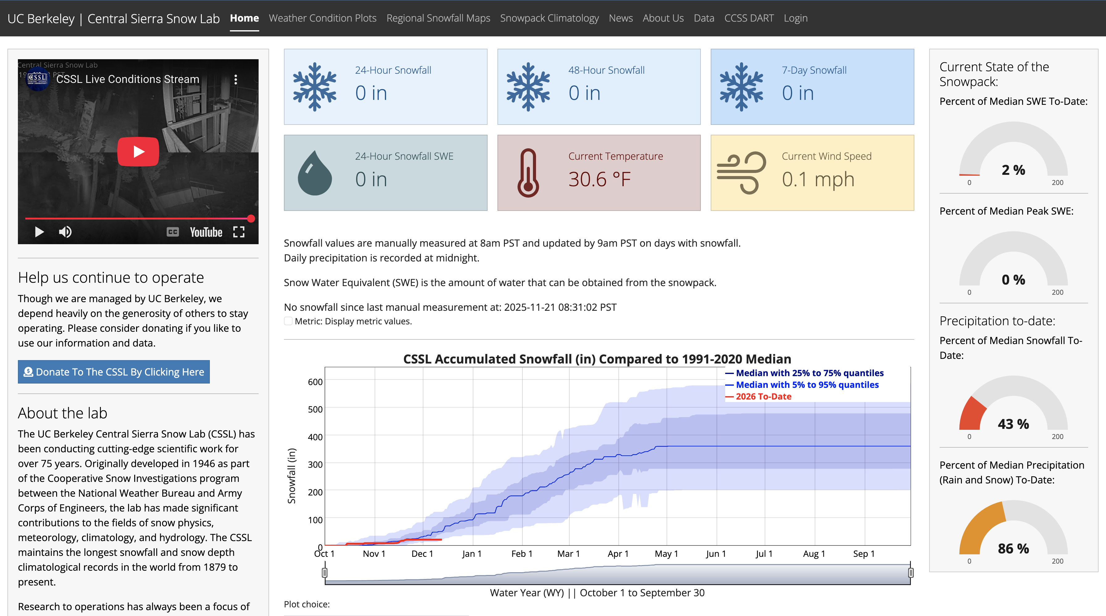
Landing Page
- Same information, better organized
- Researchers interested in datasets only can now access data directly from a button on the landing page
Visually Engaging VideographyEfficient Section Organization
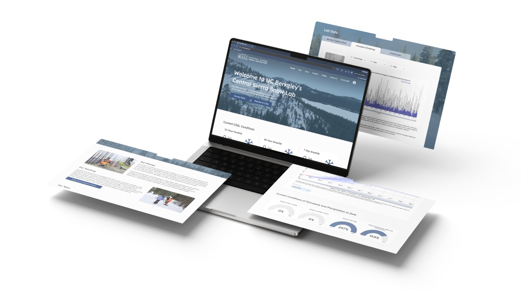
The UC Berkeley Central Sierra Snow Lab (CSSL) has been a leader in snow, climate, and hydrology research for over 75 years, maintaining the world’s longest continuous snowfall record. Our project focuses on redesigning their digital platform into a modern, data-driven website with interactive tools, real-time visualizations, and an improved admin workflow to better support researchers, collaborators, and the public.
CSSL’s current website and data tools are outdated, difficult to navigate, and lack modern visualization capabilities. This makes it challenging for researchers, collaborators, and the public to easily access real-time snow and climate data. The lab needs a clearer, more intuitive digital interface that streamlines data management, improves usability, and accurately reflects the impact of their scientific work.
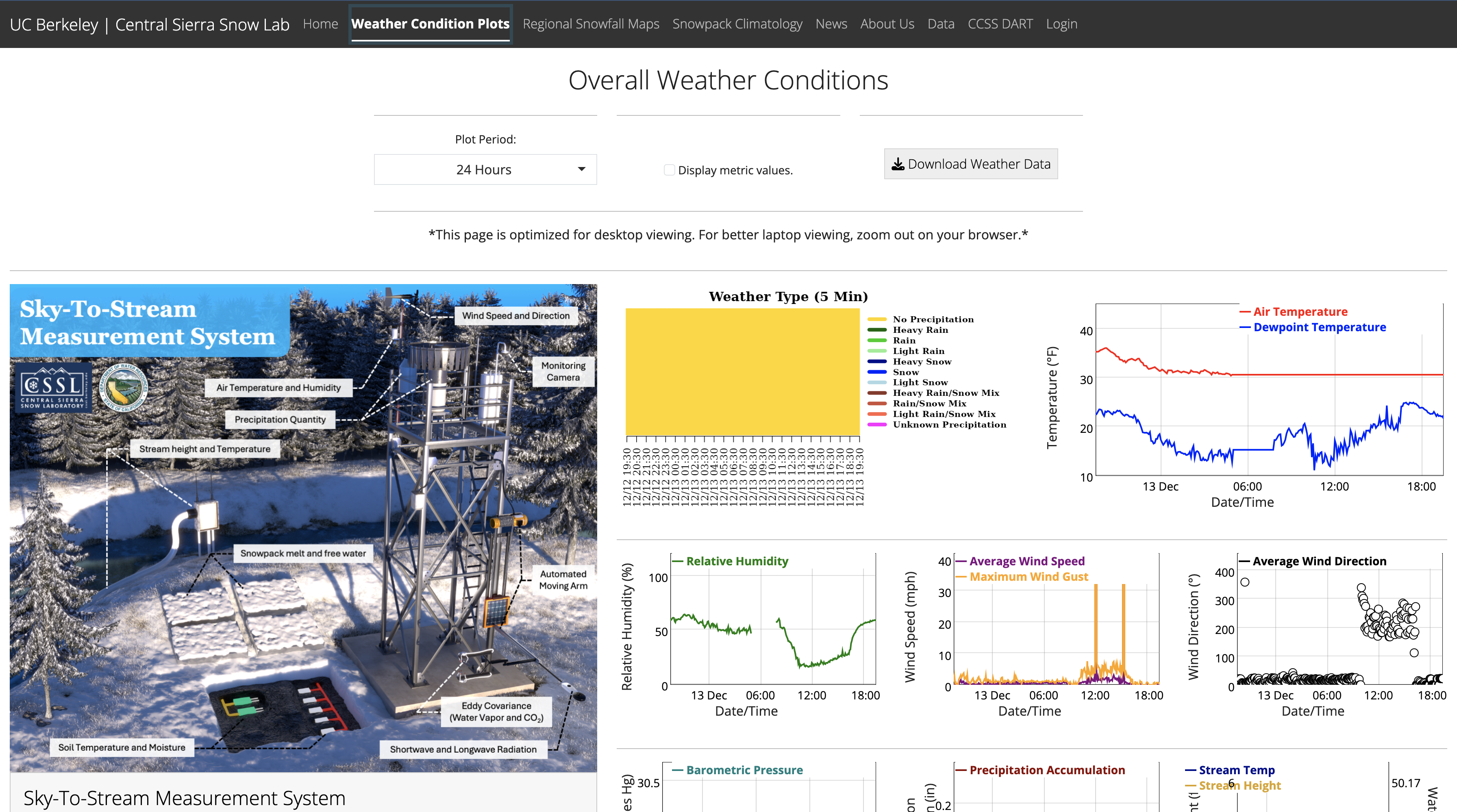
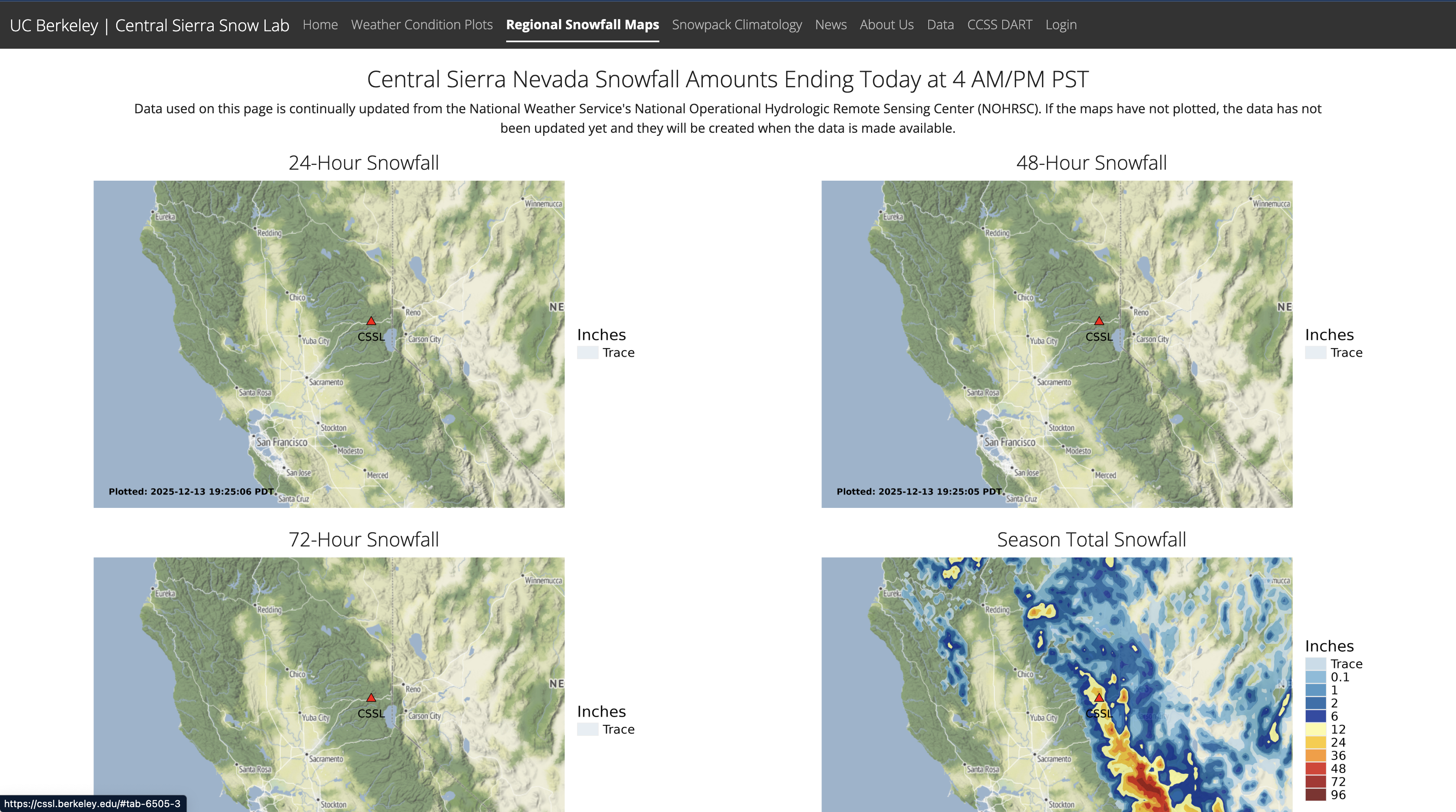
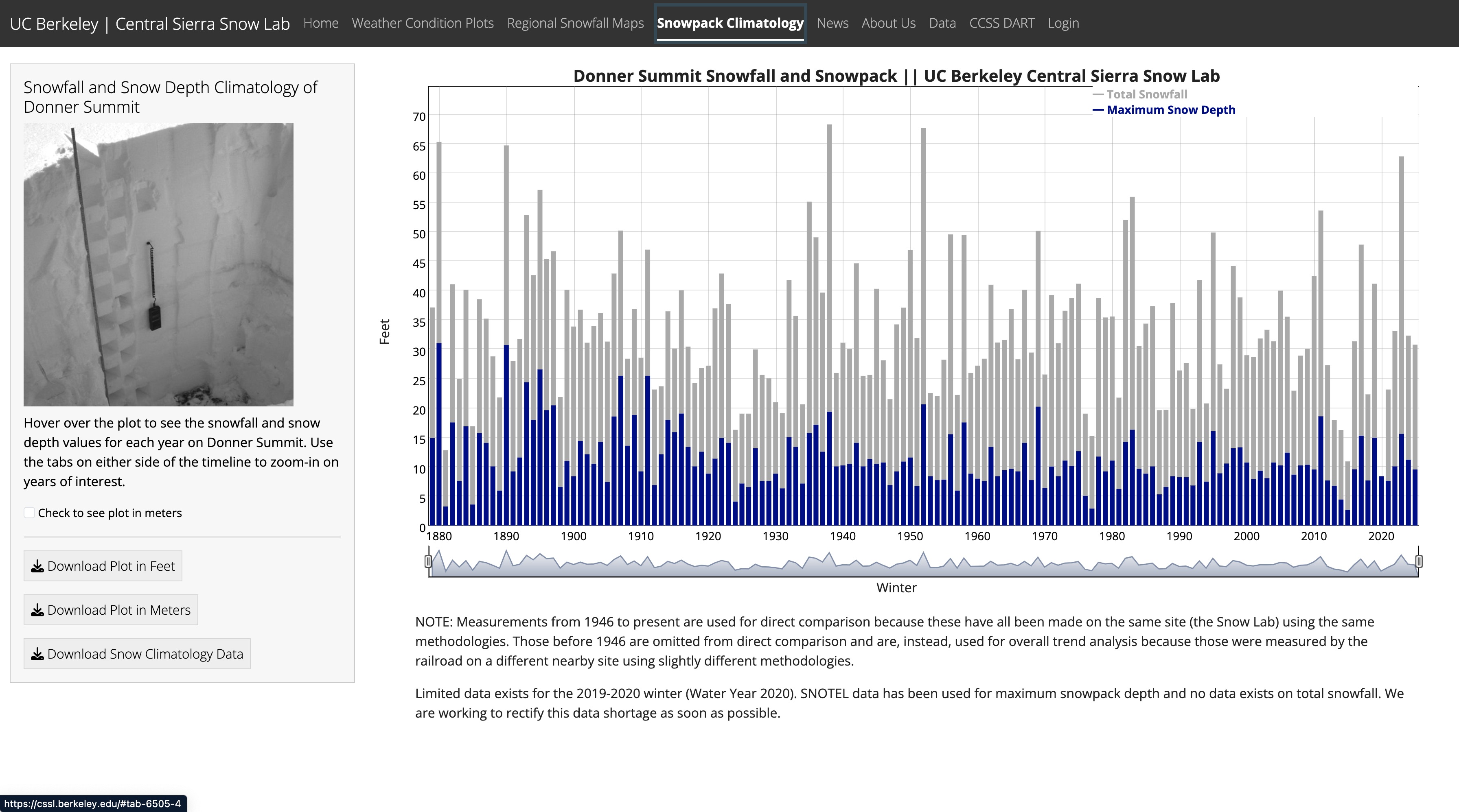
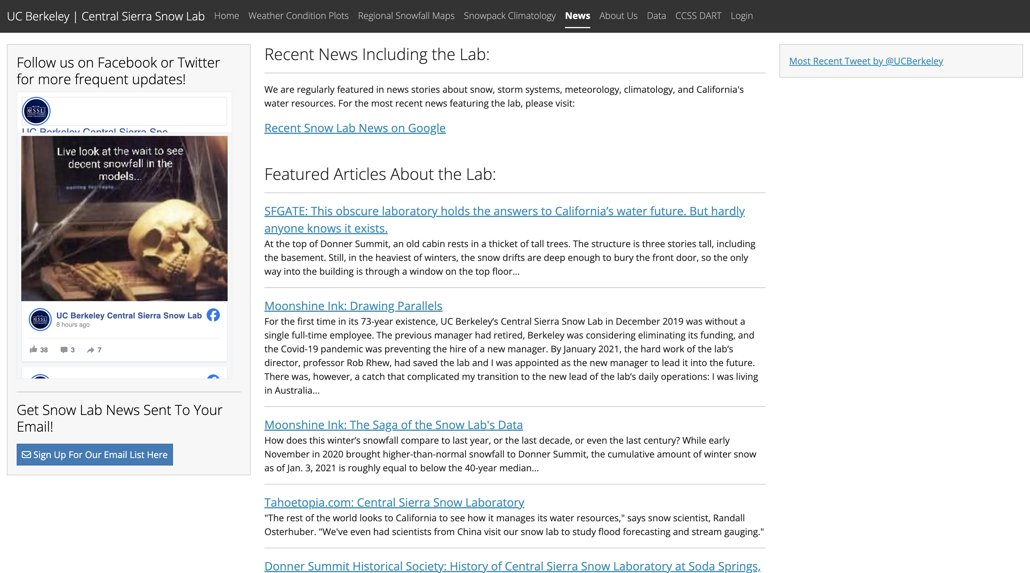
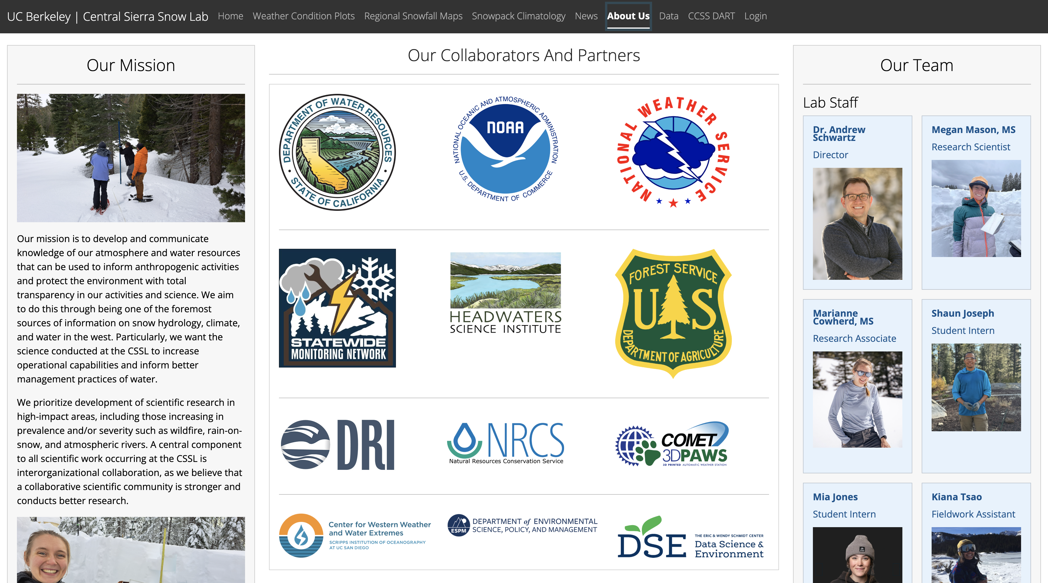
Because the CSSL website hadn’t been updated in 10+ years, we needed to first understand what web features and design elements are currently successful in the scientific research space.




We asked 10 users (a mix of students, researchers and journalists) of the CSSL website about their experiences using the website and what they thought could be improved. The main feedback we received was:
1Graphics were outdated and lacked visual hierarchy
2Too many tabs on some pages; Ineffective organization
3Inconsistent layouts across different pages
4Desire for interactive elements; Page did not feel engaging
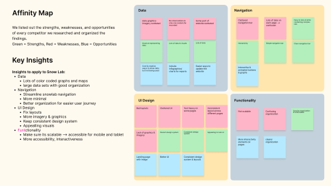
We listed out the strengths, weaknesses, and opportunities of every organization we researched and organized the findings.
We gathered the following insights to apply to CSSL:
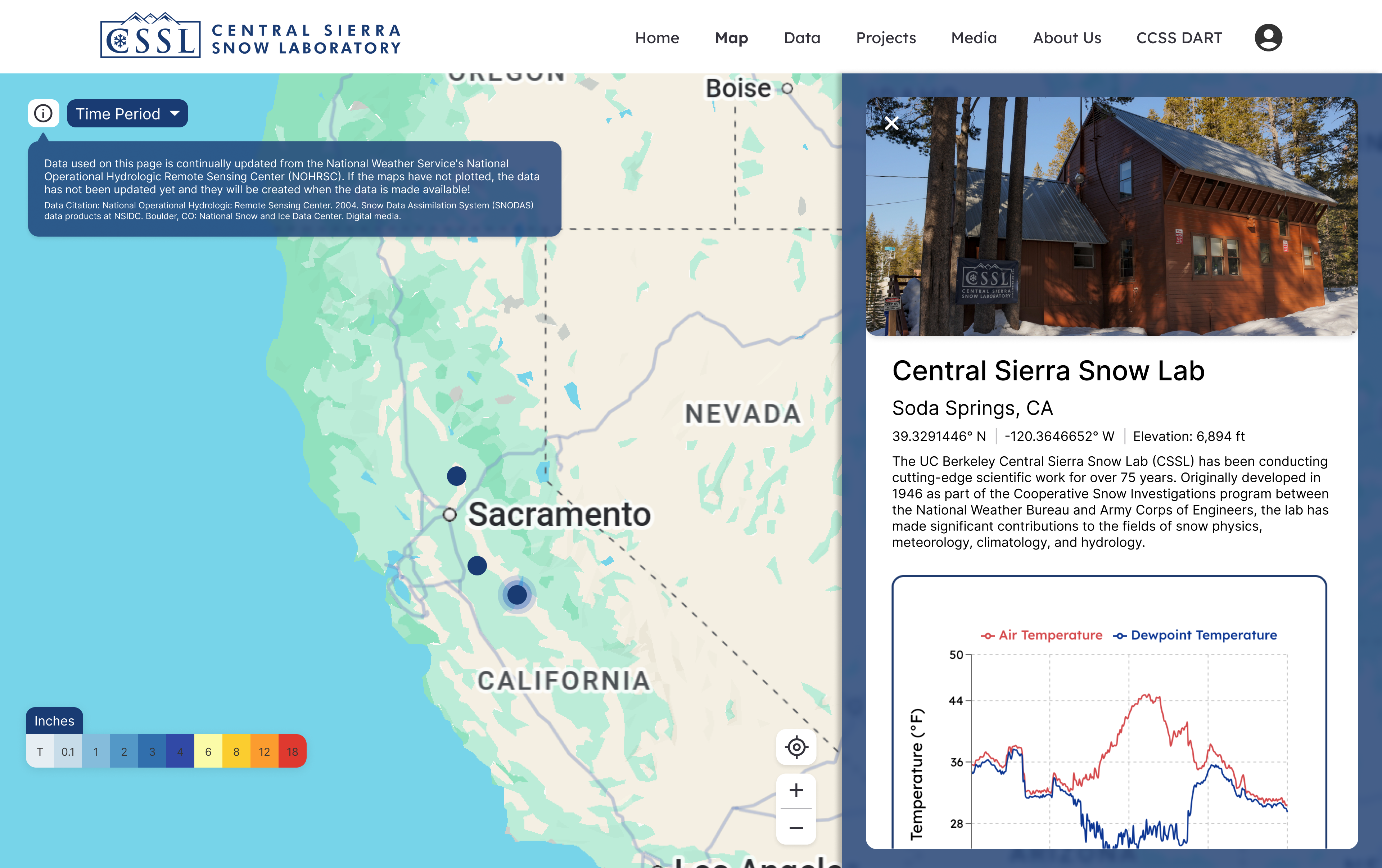
1Organized datasets with clear visualizations and maps
2Simplified navigation and information architecture
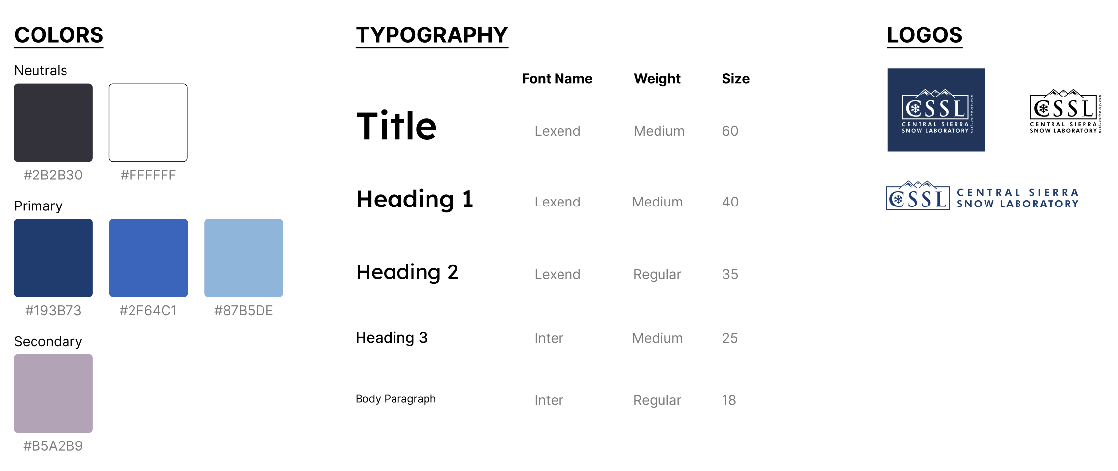
3Refined UI through consistent layouts and a cohesive design system
4Improved scalability, accessibility, and cross-device responsiveness
5Added interactive features to enhance user engagement
From our landscape research and user interviews, we concluded that there were two primary user segments utilizing CSSL’s website.
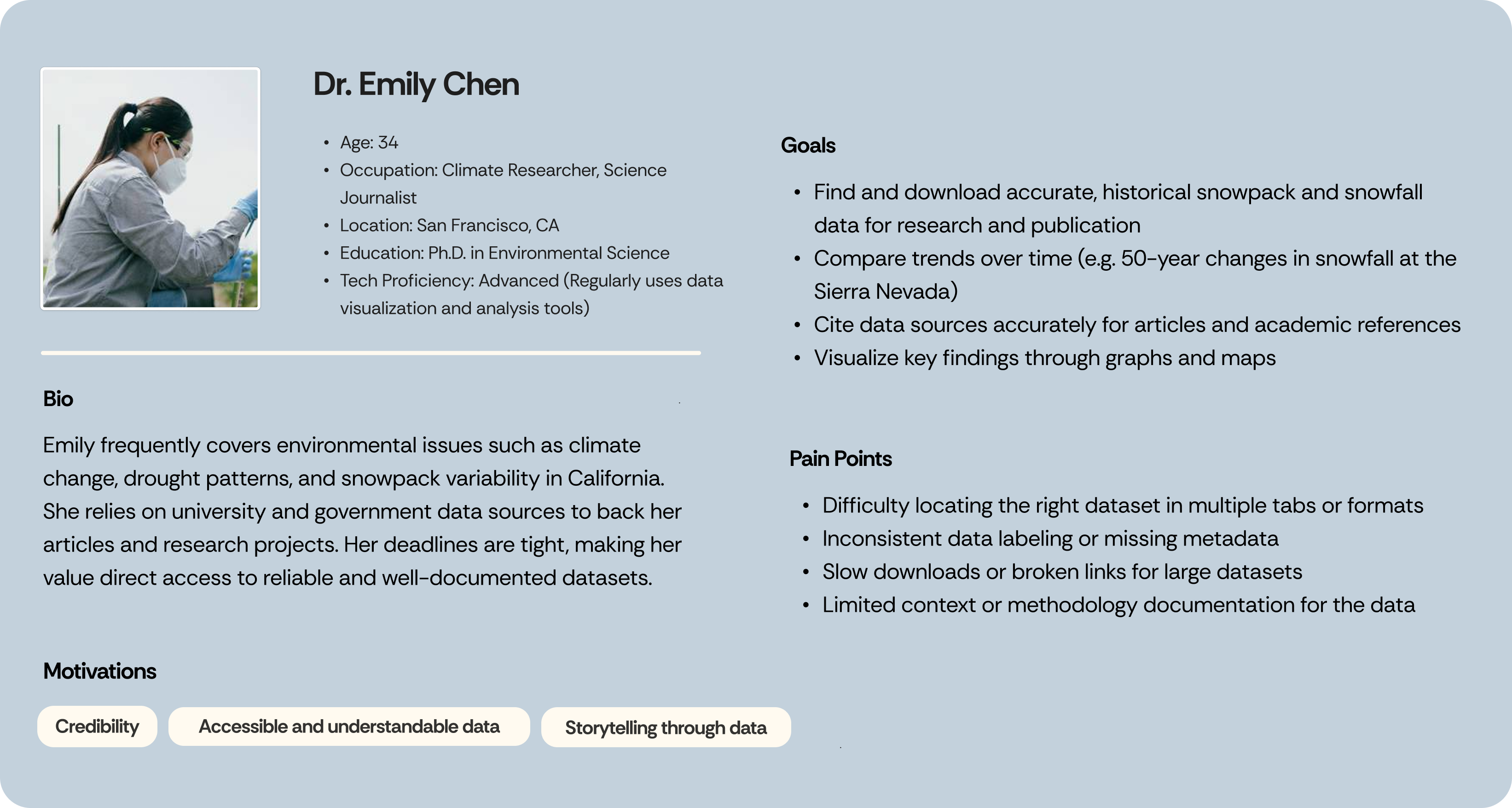
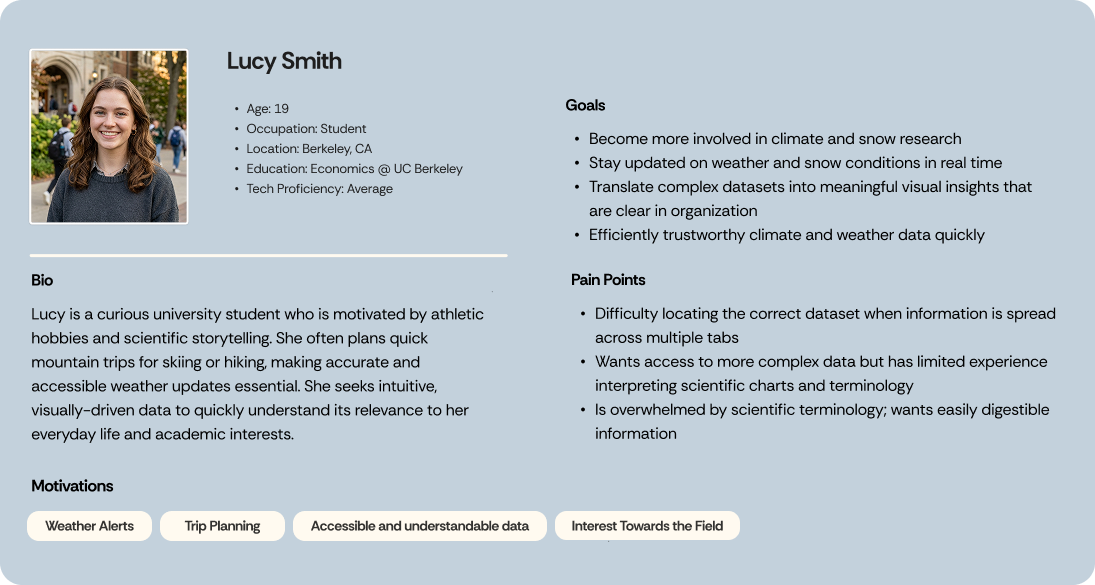
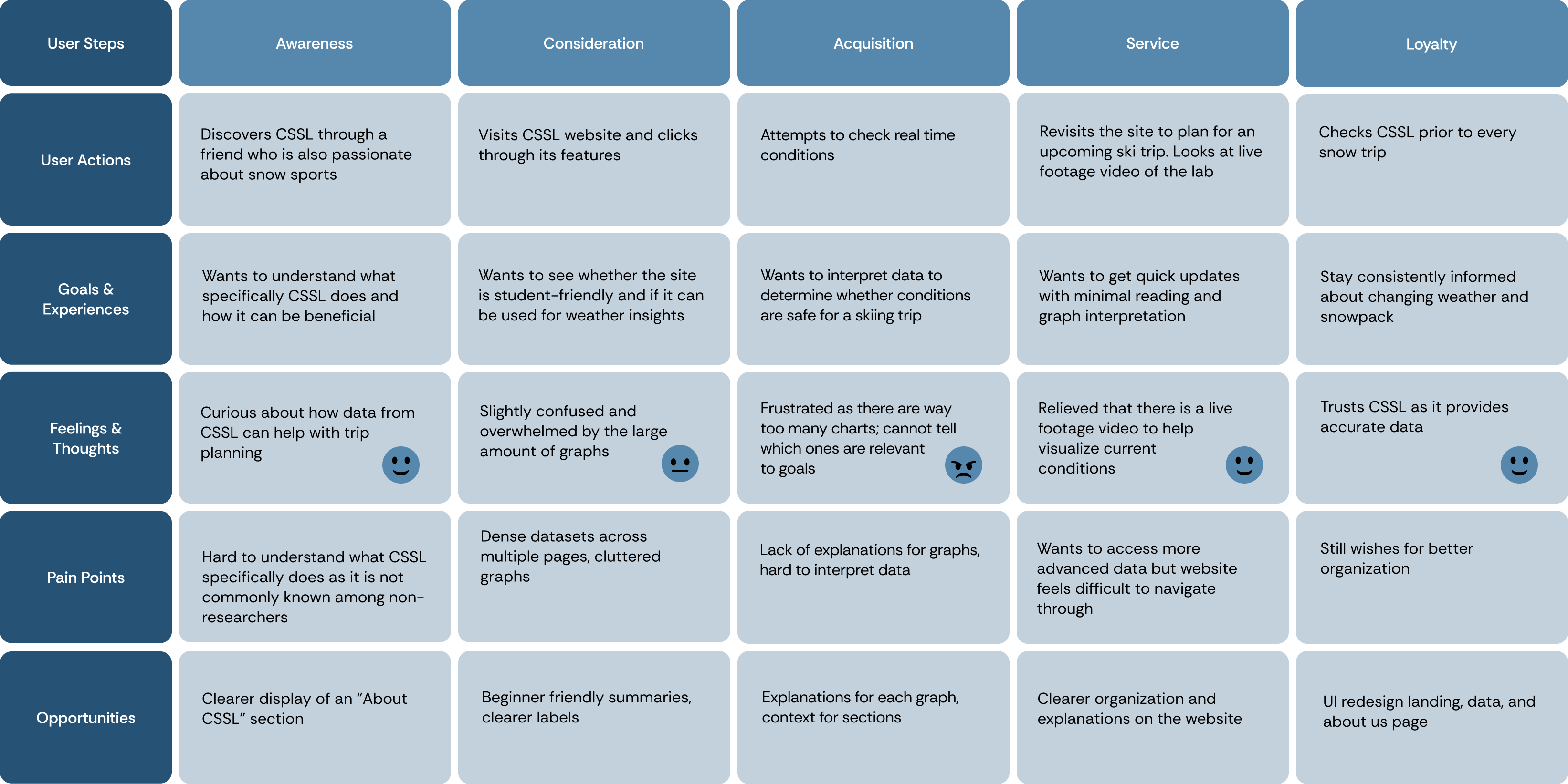
We then created user journeys to identify pain points and determine where new design solutions would best address user needs.
Dr. Emily Chen’s user journey:
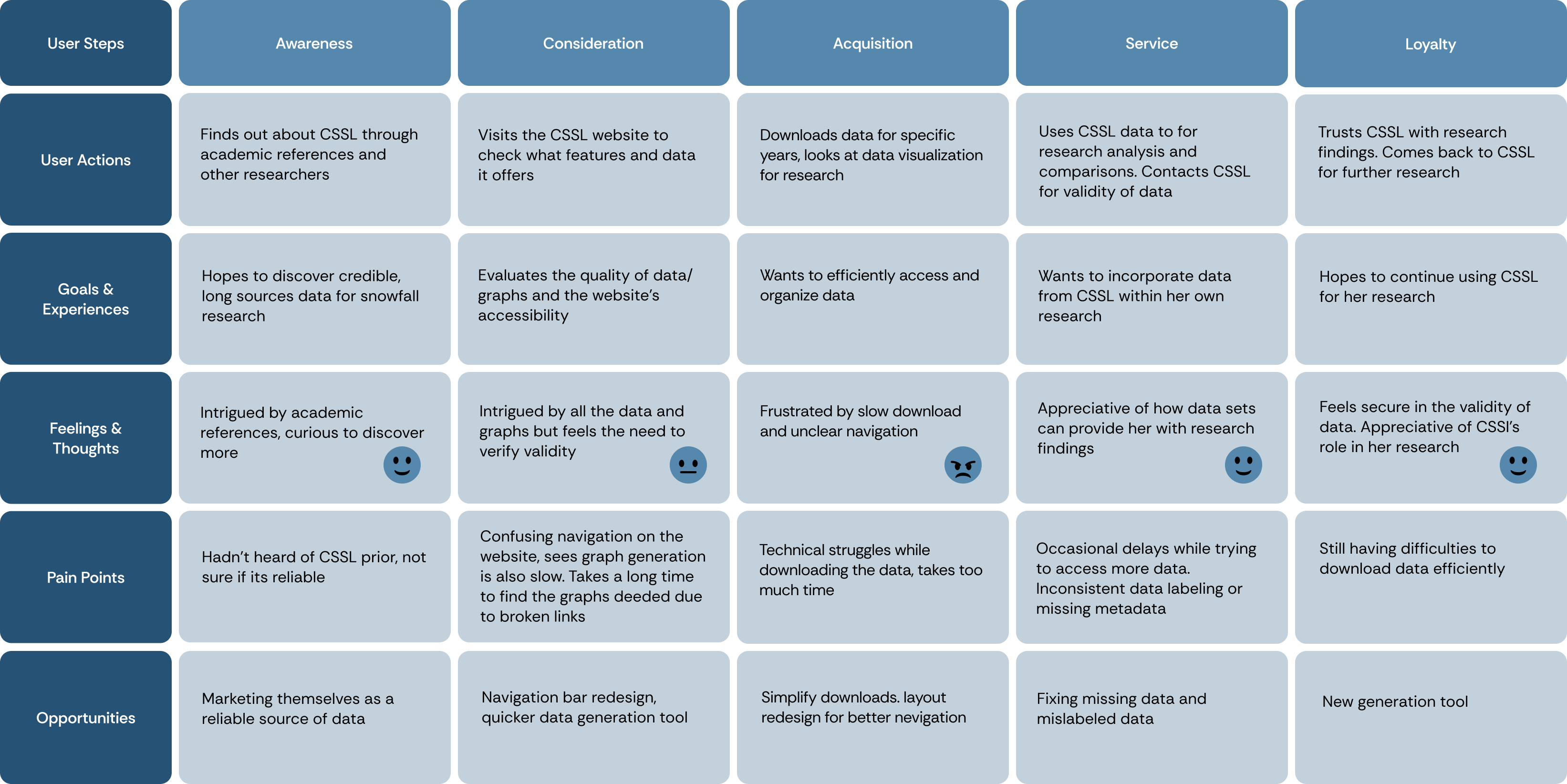
Lucy Smith’s user journey:
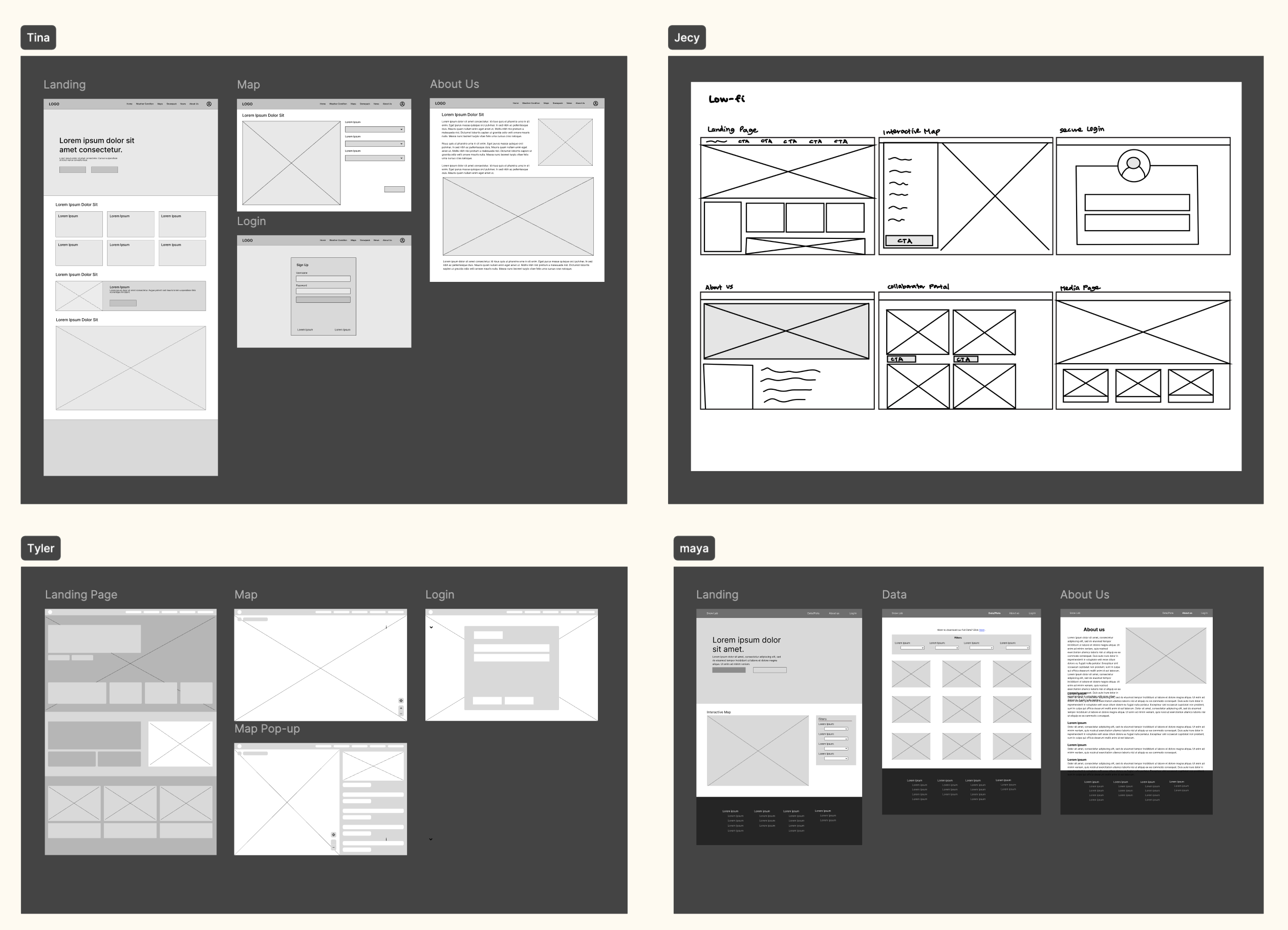
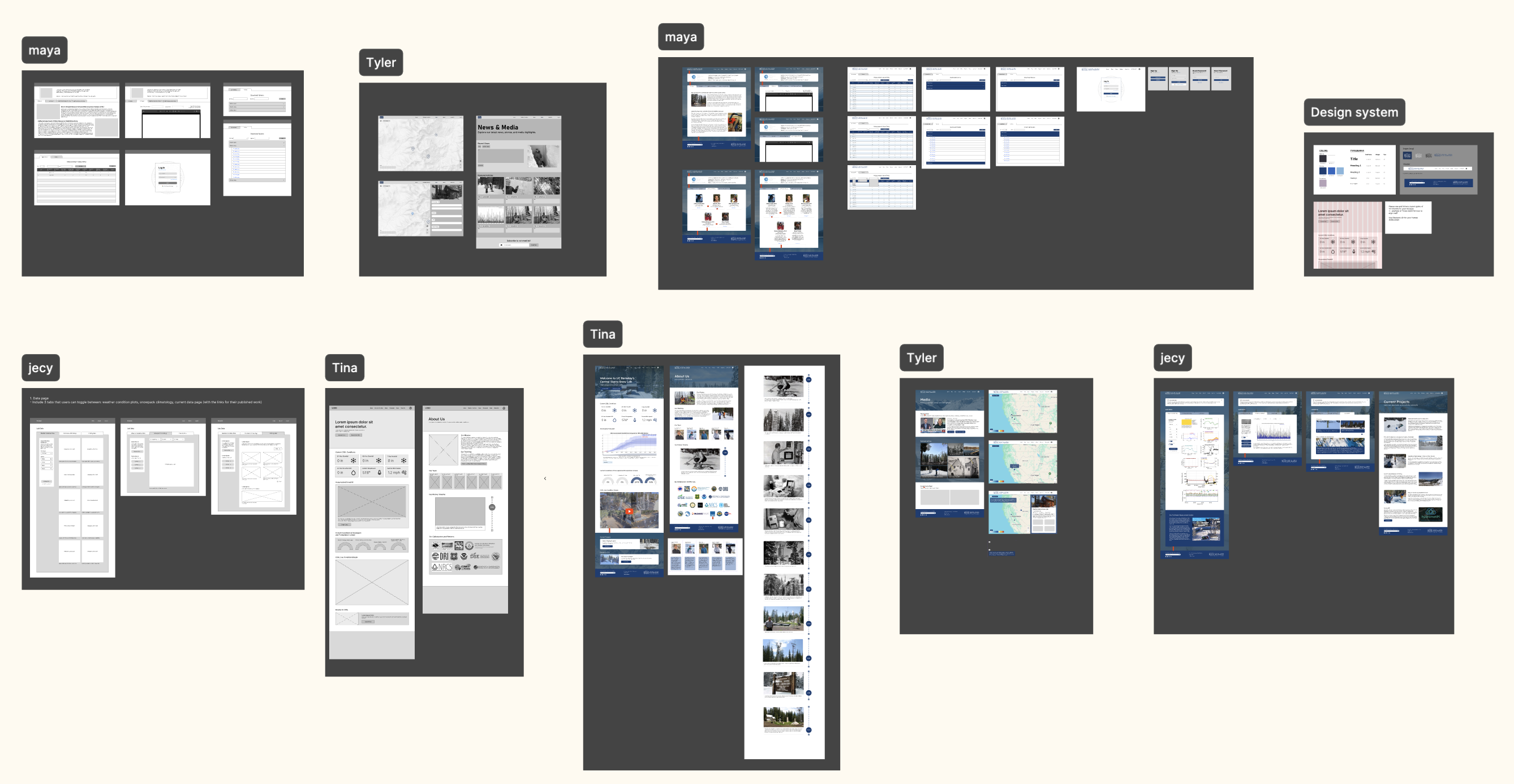
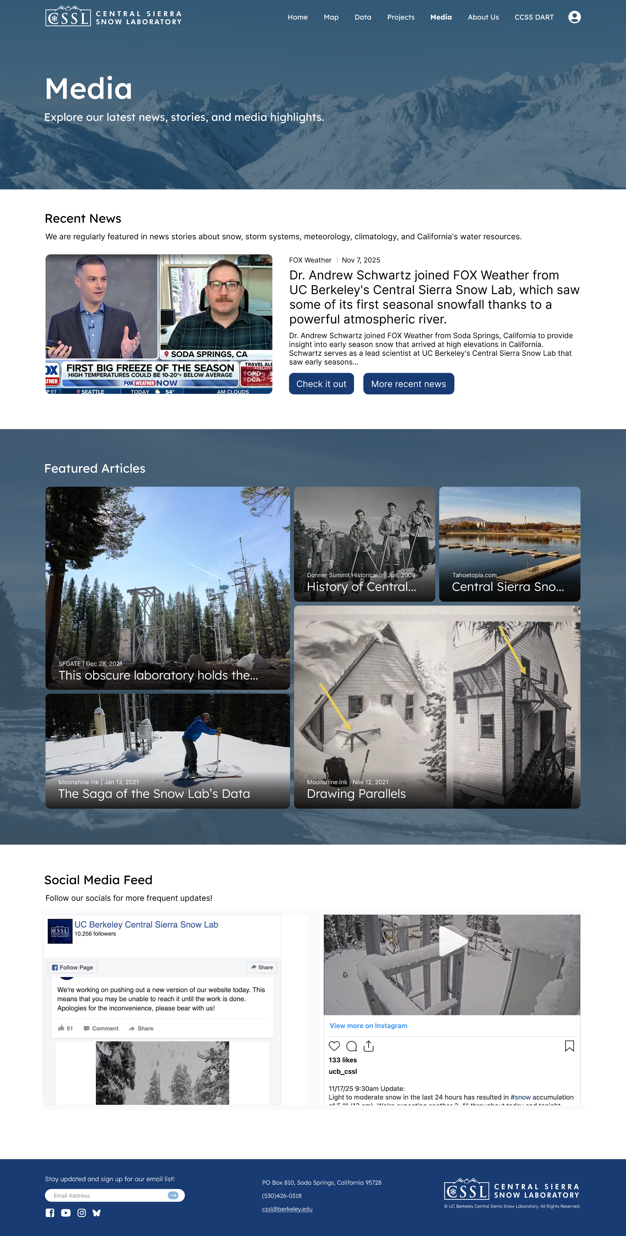
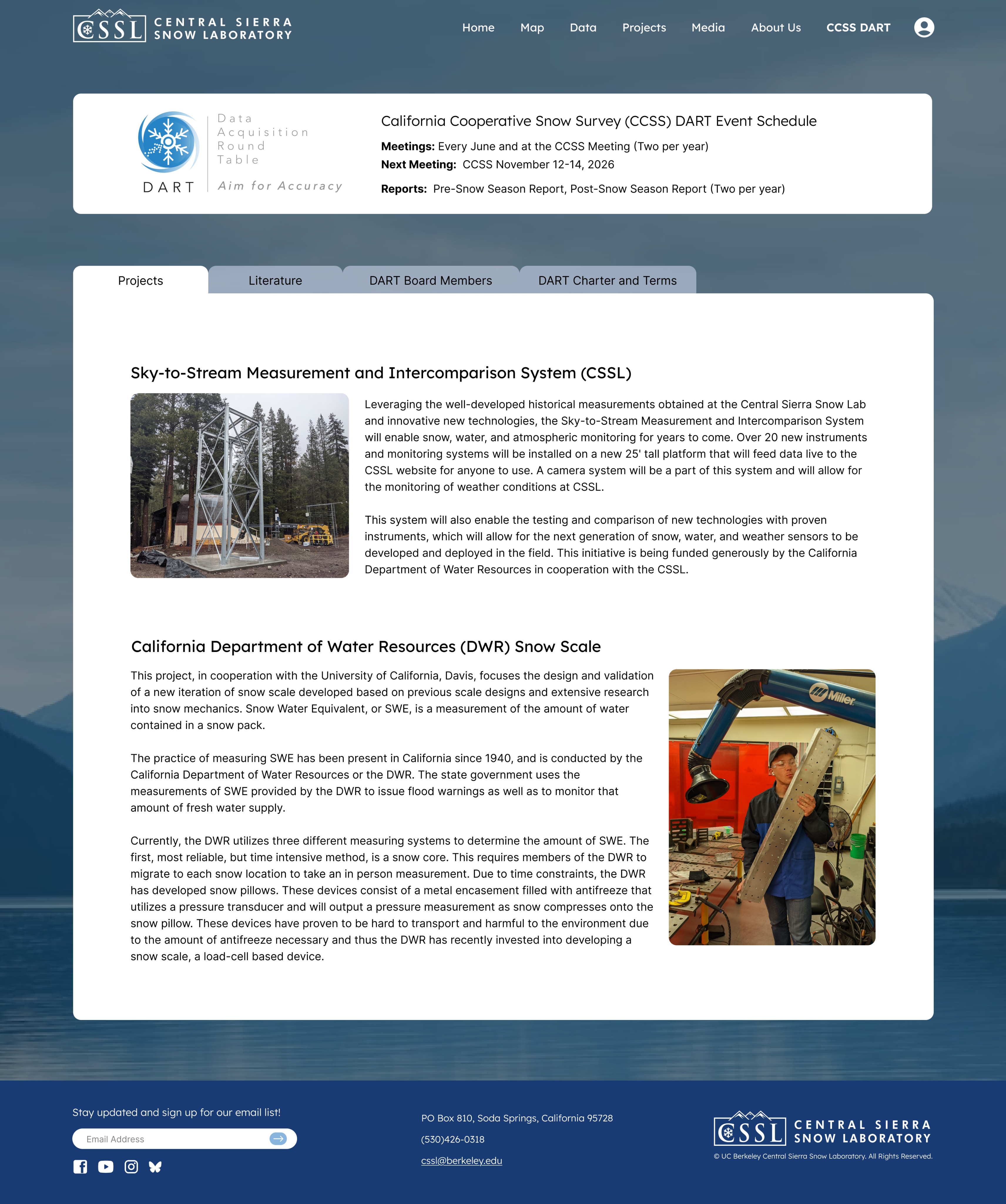
My focus was the landing page and the “About Us” page. I was tasked with preserving the information from the original website while reorganizing the content and creating a more interactive user experience.
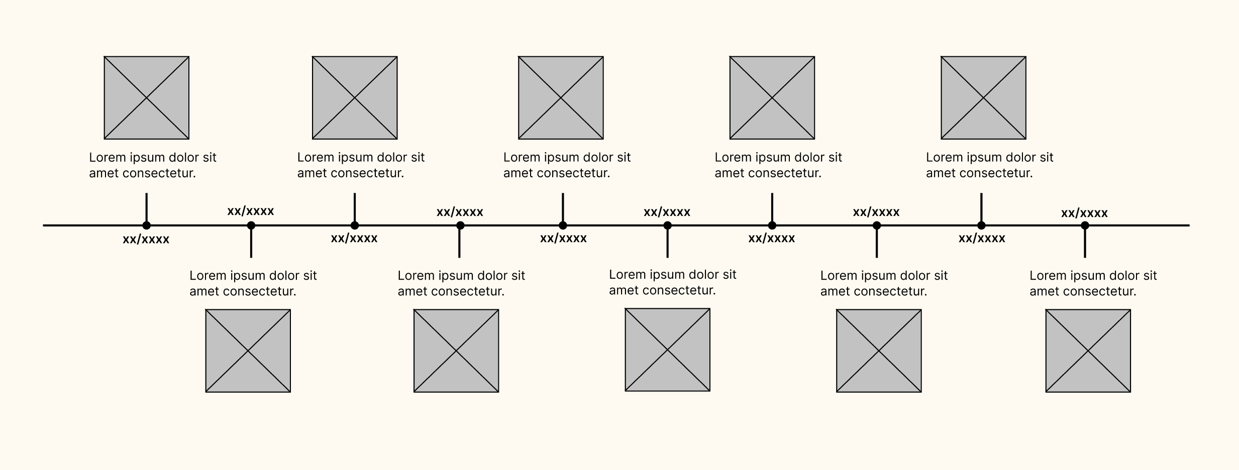
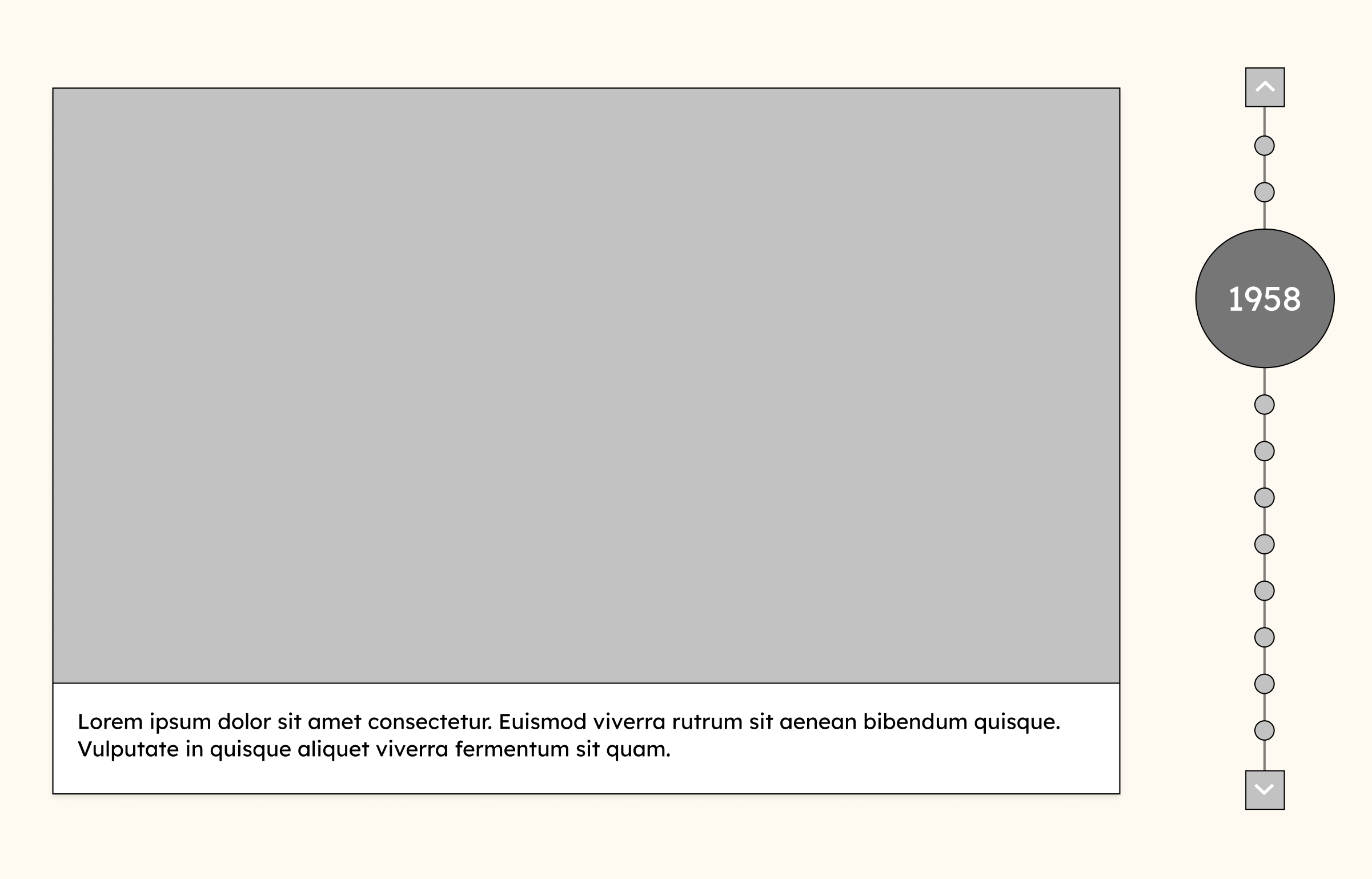
Why a timeline? I wanted to showcase CSSL’s history and research in a way that feels engaging and easy to understand for the public. After exploring two layouts, I selected the interactive vertical format (iteration #2) because it lets users focus on one milestone at a time.
Iteration #1
Iteration #2
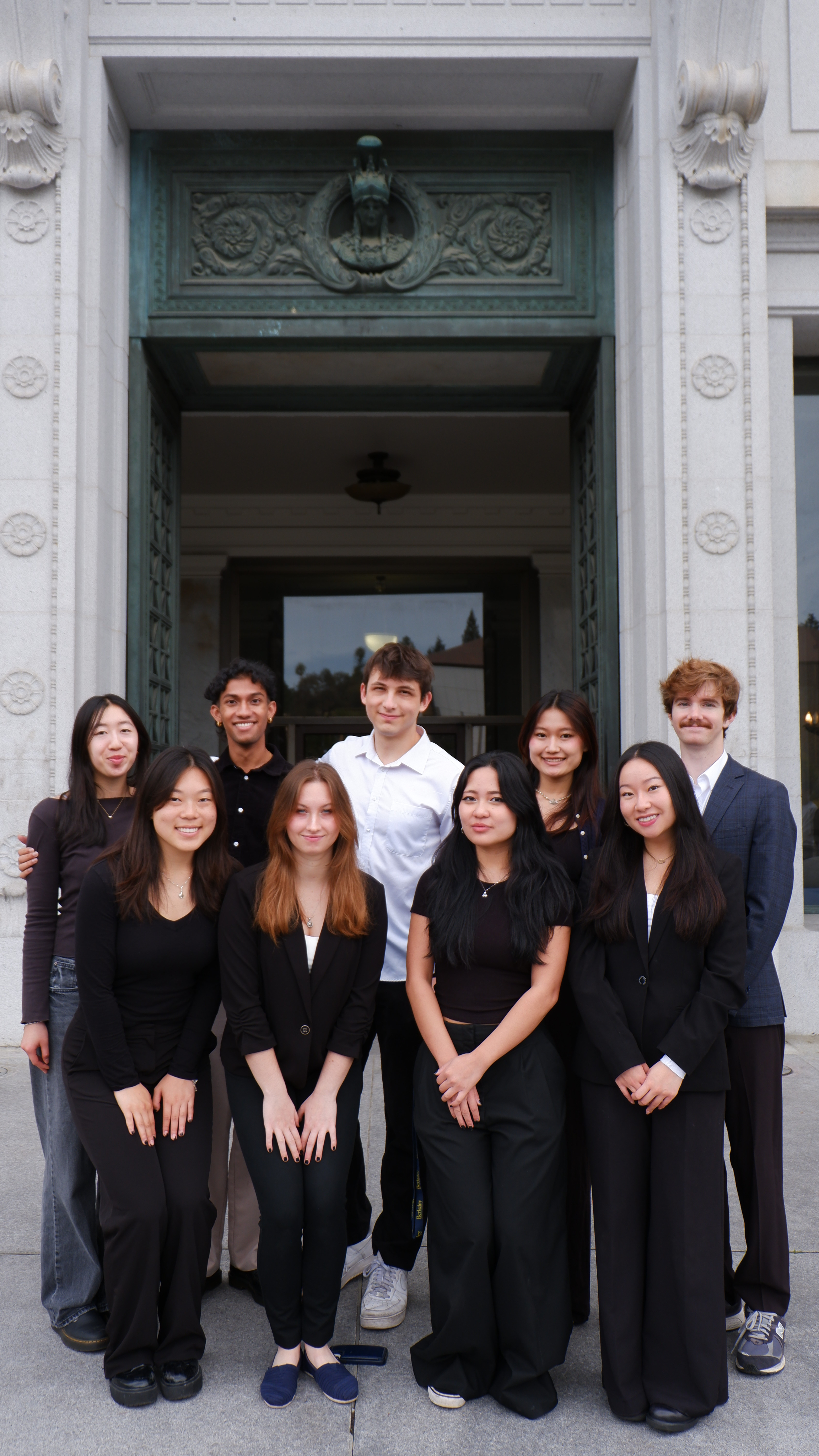
I had an amazing time working on this project alongside my team members. I especially loved how much creative freedom this project gave us as it was a complete website redesign, which allowed us to explore ideas through many iterations. While working on the history timeline in particular, I learned how important it is to communicate closely with developers throughout the design process. It is essential for designers to consider what features can realistically be implemented within technical and time constraints.
I am so grateful for this team as we had such a collaborative and rewarding experience. I also want to thank the CSSL team for trusting us with this redesign!